Checkout Branding Editor
New Feature: A full checkout branding editor is now available directly in the app - no code, no GraphQL mutations, no deploys. Customise every visual aspect of your checkout through a simple visual editor with a real-time preview. Learn more at checkoutcomponents.com/platform/checkout-branding.
Here's everything that's included:
Live preview
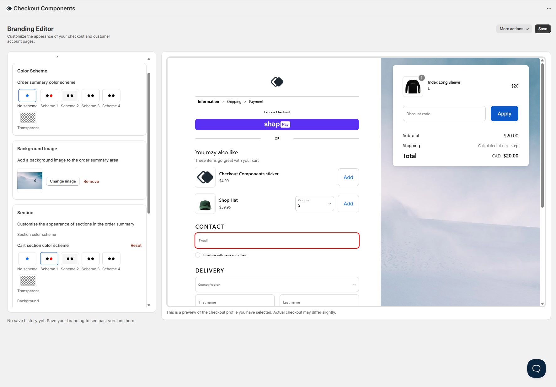
A real-time checkout preview sits alongside the editor and updates instantly as you make changes. The preview mirrors your actual Shopify checkout layout - including the main form, order summary, header, footer, express checkout buttons, form fields, product thumbnails, and even a "You may also like" upsell section. You can see exactly how your checkout will look on both desktop and mobile before saving anything.
Color schemes
Configure up to four color schemes and apply them independently to the main checkout area and the order summary. Each scheme controls background, text, accent, form control colors (background, border, text, icons), and button colors (primary and secondary, including hover states). You can also choose "No scheme" to use your global brand colors, or "Transparent" for a clean overlay look. Dark backgrounds automatically switch to light text for accessibility.
Global colors
Set your global brand and accent colors once, and they cascade across your entire checkout - primary buttons, links, focus rings, and accents all reflect your brand. These serve as the base that color schemes build on top of.
Typography
Full control over your checkout typography. Choose primary and secondary fonts (with base and bold weight configuration), and customise heading sizes, weights, letter case, and kerning at each heading level. Section titles like "Contact" and "Delivery" reflect your Heading Level 1 settings, while the "You may also like" title uses Heading Level 2. The base font size is adjustable too.
Button styling
Customise primary and secondary buttons independently - background color, text color, hover states, and corner radius. You can also disable button backgrounds entirely (set to "None") for a text-link style, and the editor correctly handles the text color priority so buttons remain readable.
Form controls
Style text fields, select dropdowns, and checkboxes. Control border color, background, text and placeholder color, icon color, corner radius, and label position. The live preview shows these changes on every form element including the email field, address fields, discount code input, and province/country dropdowns.
Header & footer
Position your header in three locations: full-width at the top, inline above express checkout, or inline above the order summary. Upload your logo, set its width, control alignment (start, center, end), and toggle a divider. Footer supports the same position and alignment options with its own divider setting. The live preview reflects all header and footer positions accurately.
Product thumbnails
Control how product images appear in the order summary - border (on/off), corner radius, badge style, and image fit (cover or contain). These settings apply to the product thumbnails visible in both the order summary and the live preview.
Layout & corners
Set the global corner radius that applies across buttons, form controls, and other UI elements. Control section-level styling for the order summary - including section border (solid, dashed, dotted), border width, corner radius, padding, and shadow.
Navigation (buyer journey)
The buyer journey breadcrumb (Cart > Information > Shipping > Payment) respects your color scheme's icon color for the separator arrows and accent color for the active step link.
Multiple checkout profiles
Work across multiple branding profiles - production, staging, seasonal campaigns, or A/B tests. Switch between profiles with a single click, and a clear "Live" indicator ensures you never accidentally edit your production checkout. A warning banner appears when editing a published profile.
Save history & one-click revert
Every save is logged automatically with a timestamp in your store's timezone. Click any previous save to see a visual diff showing exactly what changed (red for removed values, green for new). If something doesn't look right, revert to any previous version with one click - no developer required.
Dividers
Customise divider styles (color, width, style) that appear between checkout sections.