New feature
New Feature: Reach integration for international checkout
A new Reach integration adds a ready-made, pre-translated banner that tells international customers their order will be processed by Reach, a merchant of record.
All the latest updates, improvements, and fixes. Subscribe to the RSS feed to stay in the loop.
A new Reach integration adds a ready-made, pre-translated banner that tells international customers their order will be processed by Reach, a merchant of record.
Upsell components can now discount the products they offer. Customers see the reduced price directly in checkout before adding the product to cart, and the discount is applied automatically when they add the product. Anything already in their cart keeps its normal price.
Upsell components can now recommend your store's best selling products, with no product picking, collections, or integrations required. The upsell source picker has also been redesigned as a clearer list.
Product recommendations can now show an extra line of information underneath each product's title and above its price: static text, a product metafield value, the product type, or the product vendor.
Two smaller quality-of-life improvements. You can now hide the variant name shown next to single-variant recommended products, and banner components no longer require a title.
Selecting a variant on a recommended product in checkout (a different colour, for example) now updates the product image to match that variant.
The app home page now greets each member of your team personally, tailors your setup to the goals you care about, and gives brand-new stores a working AI upsell as soon as your trial starts.
The Help buttons component now supports a side-by-side layout, a formatted title and subtitle, and per-button style and colour controls.
The clickable link on a Countdown Timer's banner image can now be set per language.
You can now show or hide components based on the UTM parameters a shopper arrived with, or whether they came from an AI chat assistant such as ChatGPT, Gemini, Perplexity, Claude, or Copilot.
A new Progress Bar content component lets you motivate shoppers with a visual bar that fills as they get closer to a goal - like a spend threshold, an item count, or a checkout step.
The Analytics dashboard has been rebuilt with a new Funnel Analysis surface for understanding checkout behaviour end-to-end, and customer-segment drilldowns that let Pro and Enterprise merchants view every metric for a specific cohort instead of all customers.
Upsell components can now show a small percentage-off badge next to the price on products that are on sale.
A new setting lets you control whether upsell recommendations preselect a variant that matches what's already in the customer's cart - for example, automatically preselecting size 12 on a recommendation when the customer already has a size 12 in their cart.
The admin editor for Call to Action content components has been redesigned to be easier to scan and edit. No changes to how the component renders in checkout - only the editor in the admin.
Image components can now hold more than one image and display them as a carousel. Shoppers can move between images with tappable dots, and you can optionally have the images rotate automatically.
Display rules that target a product tag, product type, or product vendor can now also require a specific quantity of matching items in the cart - for example, "only show this component when the cart has at least 3 items tagged 'gift'."
Review (testimonial) content components now support markdown formatting in every text field, and each text field can be styled independently - font size, weight, and alignment - instead of sharing one set of controls across the whole review.
Compose recommendation mappings can now target specific product variants, both for what must be in the cart (the trigger) and for what you want to recommend. Previously mappings only worked at the product level, so any variant of a trigger product would fire the rule. Now you can say "only if the Small Red variant is in cart" and "recommend the Large Blue variant specifically".
Picking which display rule to add to a component is now much faster. The rule selection screen now has a search box and category tabs, so you can jump straight to the rule you want instead of scrolling through every option.
When you save a new component, you now stay on that component’s editor instead of being taken back to the components list. That way you can keep adjusting settings or add the component to checkout without hunting for it in the list again. Saving changes to an existing component already kept you on the same screen; this aligns the “create” flow with that experience.
The analytics "By component" view now shows the specific variant of each component (e.g. carousel, grid, checkbox, help_buttons) directly in the table, making it easier to identify components at a glance without needing to open each one.
You can now see how many times customers are clicking on links and buttons inside your non-upsell checkout components, such as help buttons, image banners, call-to-action links, and more.
Scheduled A/B tests now start and end automatically. When you schedule a test with a future start date, it will activate on its own when the date arrives -- and when the end date is reached, the test will complete automatically too.
You can now schedule A/B tests to start on a future date instead of starting them immediately. This gives you more control over when your tests begin, so you can plan around promotions, product launches, or peak traffic periods.
You can now run A/B tests on any checkout component to find out what works best for your store. Split checkout traffic between two component variations, or between a component and no component, and compare results side by side with a dedicated analytics dashboard.
A brand new Countdown Timer component is now available in the component catalogue, helping you create urgency and drive conversions during sales, limited-time offers, and product launches.
Image banners, callouts, and trust badges now have the same image selection experience as campaign upsells. Instead of manually pasting image URLs, you can click "Browse" next to any image field to open a visual picker that searches your Shopify file library. Select an image from the grid, or use the "Upload file" button to add new images to your Shopify files. You can still paste URLs directly if you prefer.
Free Shipping upsell components that use collections as their product source now automatically prioritise products priced close to the remaining amount needed to reach free shipping.
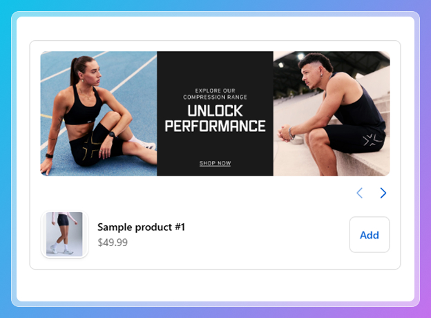
A new "Campaign Upsell" component type is now available. Upload a promotional banner image and pair it with product recommendations to create a campaign-style upsell experience in checkout.
When creating a new post-purchase component, you can now choose the "Reorder Discount" preset instead of configuring everything manually. Set a minimum cart quantity and a discount percentage - the system will automatically offer the same product the customer already has in their cart at the configured discount. This skips the trigger rules and offer selection steps so you can get a post-purchase offer live in seconds. You still have full control over messaging and optional downsell configuration.
When you open any color picker, a text field appears below the color selector where you can paste or type an exact hex value (e.g. FF5733). The color picker and the text field stay in sync - picking a color updates the hex value, and typing a valid hex updates the picker. Great for matching exact brand colors from a style guide.
Each setting in the component appearance panel now shows a "Modified" badge when its value differs from the default. This makes it easy to see at a glance which settings you've customised versus which are still at their defaults.
A new "Allow cart products" toggle is available in upsell component settings. When enabled, products already in the customer's cart will still appear as recommendations. This is useful when you want to encourage customers to buy additional quantities of something they've already added - for example, "Add another for a friend" or bundle-building strategies.
Display rules now support precise quantity conditions - "At least", "Exactly", and "At most" - for Product ID, Product name, Product collection handle, Product type, and Product vendor rules.
This lets you create tiered upsell strategies. For example:
Previously, only a minimum quantity threshold was available.
Upsell components using metafield-based product recommendations now correctly fall back to your configured recommendation provider (e.g. Searchspring, Algolia, Nosto) when no matching products are found. Previously, the fallback wasn't being triggered, causing the component to skip to best sellers or show no recommendations.
Trust badge titles now support font size, font weight, and text alignment controls. You can configure these per badge in the component editor - giving you full control over how trust badge text appears in checkout. For example, you can make a "Free Returns" badge title bold and centered, while keeping a "Secure Checkout" badge left-aligned and smaller.
Display rules using "Customer tag" with negative conditions ("does not contain" or "is not equal to") were incorrectly hiding components during guest checkout. Since a guest has no tags, a rule like "does not contain VIP" should evaluate as true - and now it does. This ensures components with negative tag conditions display correctly for customers who aren't logged in.
Variant names like "NoSize" or "One Size" are no longer shown in upsell product cards and modals. These labels aren't meaningful to customers and were adding visual clutter for products that don't have real size or style options.
You can now type any tag name and press Enter to add it as a hidden product filter, even if it doesn't appear in the dropdown suggestions. This makes it easier to filter by tags that may not yet be assigned to products or that you plan to use in the future.
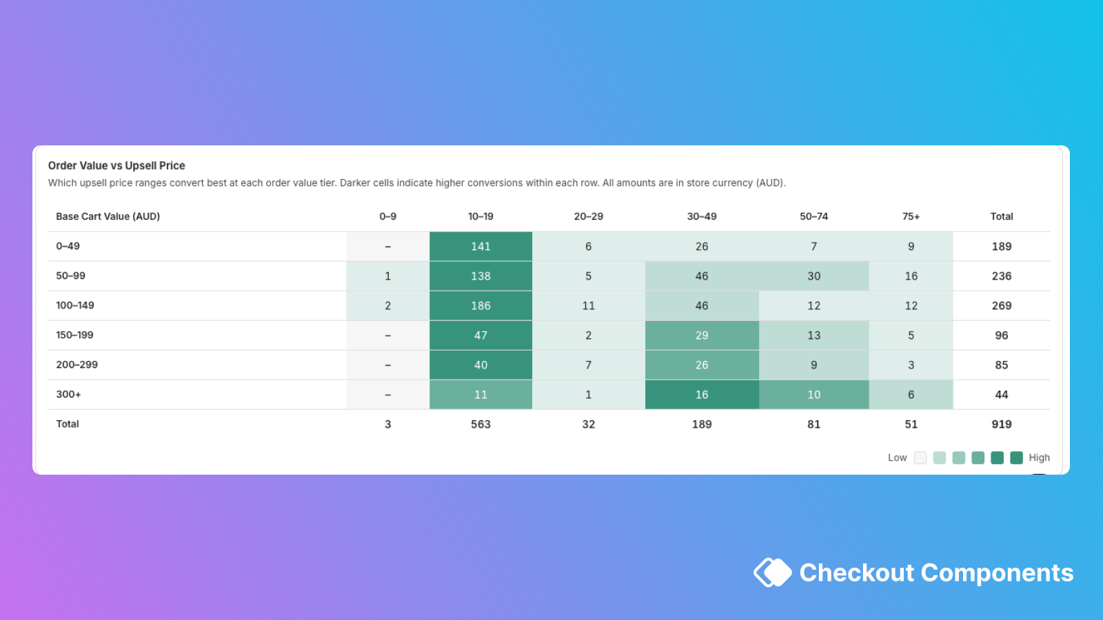
A new heatmap in the analytics dashboard shows which upsell price ranges convert best at each order value tier. For example, you can see that $15 upsells convert well for $50–$75 carts but poorly for $150+ carts - helping you optimise which products to recommend at each price point. The heatmap works correctly for all currencies.
A new "Average Order Value Increase" metric card is available across all analytics views - store overview, component drilldown, and product drilldown. It shows the average revenue lift per upsell conversion, so you can see exactly how much each upsell is adding to your orders.
The hidden products settings panel (hide by product, tag, type, or vendor) now appears for components using metafield-based product recommendations. Previously, this configuration was only visible for other recommendation sources, even though the filtering was already being applied in checkout.
You can now require a minimum quantity of matching products in the cart for Product ID, Product Name, and Product Collection Handle display rules. For example, you can create a rule that says "only show this upsell when the customer has 2 or more of Product X in their cart" - perfect for building tiered promotional strategies.
Display rules for Product tag, Product type, and Product vendor now let you choose whether all products or at least one product in the cart must match. For example, you can set a rule to "only show this upsell when every item in the cart is from Brand X" - useful for brand-specific promotions or loyalty offers. Previously, only "at least one" matching was available.
The Tagalys product recommendations integration has been updated for improved reliability and better recommendation relevance. Recommendations are now seeded from up to 3 products in the customer's cart instead of just 1, resulting in more relevant product suggestions.
Four new display rules let you show or hide components based on customer data:
Customer data is only fetched when a component actually uses one of these rules, so there's no impact on checkout performance for components that don't use them. These rules work for logged-in customers - guest checkouts are handled gracefully (negative conditions like "does not contain" correctly evaluate as true when no customer data is available).
A new display rule lets you show or hide components based on how many orders a customer has placed. Use "is greater than" or "is less than" to target different customer segments - for example, show a welcome discount to first-time buyers, a loyalty bundle to returning customers, or a VIP offer to your most active shoppers.
The free shipping upsell message and success text now support per-language translations. If your store serves multiple languages, you can customise the free shipping messaging (e.g., "You're $X away from free shipping!") for each locale.
Manually selected upsell products now always render in the exact order you configured in the admin. Previously, the order could shift unexpectedly.
A comprehensive performance overhaul makes the checkout experience faster and more stable, particularly on mobile devices. Product data loading is smarter - frequently accessed data is cached and reused instead of being re-fetched, and manual product selections load in two phases so the first page of products appears faster. These improvements resolve checkout crashes that some stores experienced on iOS Safari when running many components with large product selections.
Analytics now show net revenue (after discounts) alongside gross revenue and total discounts across all views - store overview, component drilldown, and product drilldown. This gives you an accurate picture of your upsell revenue even when discount codes or automatic discounts are applied.
The analytics experience has been completely rebuilt from the ground up.
A new "Hide product thumbnail" setting is available for checkbox upsell components. When enabled, the product image is hidden and the layout adjusts to show only the checkbox, product details, and price - useful for a more compact presentation where the image isn't needed.
Tagalys is now available as a product recommendations provider for upsell components. Configure it in the Integrations settings page with your Tagalys Base URL, then choose a recommendation model (e.g., "bought also bought" or "viewed also viewed") per component. Recommendations are seeded from the customer's cart for relevant suggestions.
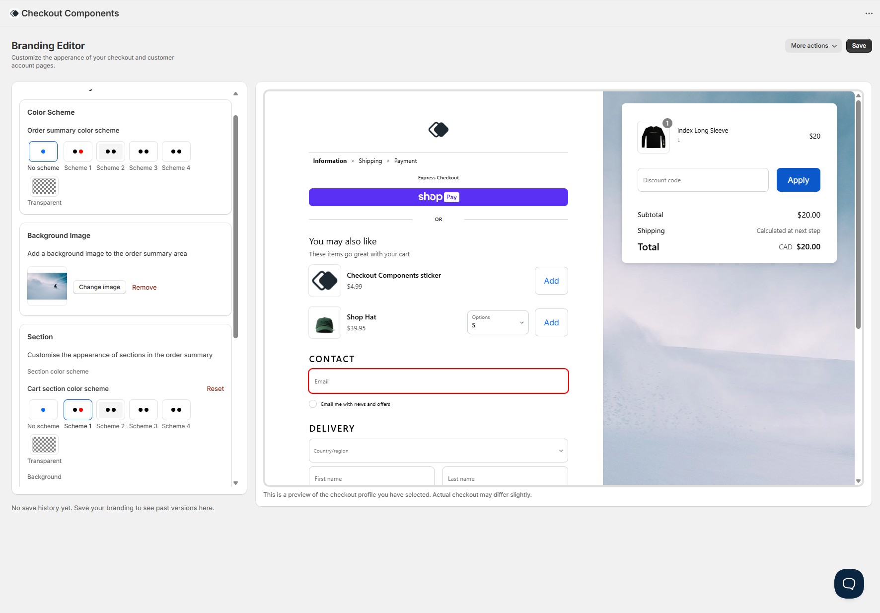
New Feature: A full checkout branding editor is now available directly in the app - no code, no GraphQL mutations, no deploys. Customise every visual aspect of your checkout through a simple visual editor with a real-time preview. Learn more at checkoutcomponents.com/platform/checkout-branding.
All customer interactions with your components are now tracked in detail - including clicks, add to carts, dismissals, modal views, variant selections, and pagination. This data feeds into the analytics dashboard for detailed reporting on how customers engage with each component.
All upsell and content components now automatically track when they're viewed by a customer. Combined with interaction tracking, this gives you a complete picture of your conversion funnel - from impressions through to completed upsells.
A step-by-step wizard for creating post-purchase upsell offers. Configure who sees the offer with display rules, select products (manually, using Shopify AI, or through a recommendation provider), set a discount, customise the banner messaging with countdown timers and translations, and optionally add a downsell offer - all in a guided 4-step flow.
The component catalogue has been redesigned with a cleaner layout, better categorisation, and clearer descriptions for each component type. Makes it easier to find and create the right component for your use case.
A packed end-of-year release with improvements across upsell components, post-purchase, and the admin UI.
In time for BFCM25, Checkout Components released over 25 updates. To learn more about some of the major updates, head to our website.
Pro merchants can now display review stars and counts on product recommendations in upsell components, helping drive conversion by increasing trust and credibility.
We're extending display rules functionality in the near future. Before that, we wanted to deliver the new UI and experience to all merchants. An "authority to leave" input template has been added to the app. Free plans can only create one upsell component.
Checkout Components now has an interactive analytics dashboard. Merchants can see how their components are performing across date ranges and specific days. The dashboard shows revenue generated by upsell components, AOV lift on eligible orders, total orders with upsells, and total upsells purchased.
After many requests, component forms now have a preview of what the components will look like in your checkout. Documentation will now start showing in context to what you are doing.
Checkout Components now has an official documentation website at docs.checkoutcomponents.com. This is the home for all guides, tutorials and API documentation for the app.
Large upsells get an overhaul with a new UI. Large upsells will render more clearly, particularly with the border setting enabled.
The team has been working on improvements to modals and web accessibility.
Just in time for BFCM 2024, a new analytics system has been shipped. Track the performance of components in real-time with revenue breakdowns, top performing products, and a holistic view of revenue generated by all upsell components.
Date pickers can now support disabling a specific date or date range. This can be used in conjunction with the existing feature of disabling specific days of the week and buffering days.
In a single component, merchants can now conditionally render whether or not customers can edit line items mid-checkout. Options include editing the quantity, removing the item, or selecting a different product variant. Merchants can also enable in-checkout personalisation which is saved against the product as a line item property. All extensions have been upgraded to Shopify API version 2024.04.
Upsell components can now be integrated with Nosto. This allows merchants to use Nosto to power their upsell components. Content components now support mobile specific images, feature requests can now be made via the admin, you can conditionally render to specific states, minimum spend now references the cart subtotal (exclusive of shipping), and you can now hide products from appearing in upsells.
All non-deprecated upsell components now have clickable product thumbnail images. When clicked, a modal containing product details is shown to the customer, allowing them to see more information about the product before adding it to their cart.
Both Large Upsell and Checkbox Upsell variants can now optionally enable customers to leave notes associated with the upsell. This is great for upselling premium packaging or product customisation.
A new upsell type built specifically for handling donations (or any product that fits a radio group). This upsell type is a radio group that allows the customer to select one of the product's variants. New upsell components can also choose how variant selectors are displayed on mobile - inline or stacked.
Upsell components have been updated with better styling, variant selection that updates the thumbnail image, button control and much more.
Merchants can now add radio options to their input components. There are two supported styles: plain and grouped. Radio options are excellent for a required choice from the customer, such as authority to leave choices or gift wrapping options. The input component form in the app has also been updated.
Option selection is now on a new row next to the add to cart button. Products are also separated by a divider to make it easier to see where one product ends and another begins. This is particularly useful for merchants who have products with variants and longer product names.
Input components have been completely overhauled. Merchants can now have multiple fields in a single input component with access to templates including Gift Notes, Terms Agreement, and blank templates. Existing input components have been marked as deprecated.
Prefix icons can now be added to content components of the "Text" template. This allows merchants to prefix their message with an informative icon.
Upsell components, regardless of their source, can now be paginated. The component shows three products at a time with next and previous buttons for discovering more recommendations. Set the product quantity to more than 3 when editing or creating an upsell component to make the most of this.
Merchants can now select one or more collections that upsell components should source products from. This can be used effectively when running a sale on specific collections.
Input components that use date pickers can now block specific days of the week. This can be used to prevent customers from selecting days that are not available for delivery or collection. This works in combination with buffer days.
Merchants can now show components to customers in specific Shopify Markets. Target specific countries or groups of countries and show important information, or ask for more information via input components. All components can be published to specific or all Shopify Markets.
Algolia can now be integrated with Checkout Components. Merchants can use Algolia Recommend to power their upsell components via app settings. All tracking events Algolia requires are catered for.