Translations
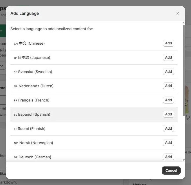
Write component content in multiple languages. Show the customer's language, with your default wording as a fallback.
Choose the audience, shape the presentation, and write for each market. Explore the tools that connect your checkout components.
Write component content in multiple languages. Show the customer's language, with your default wording as a fallback.
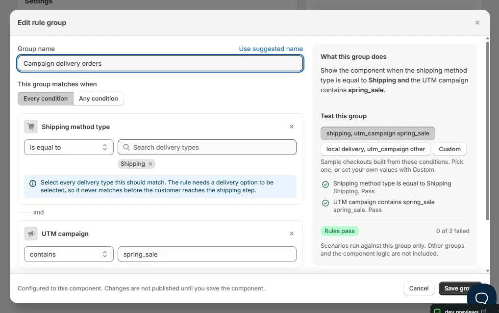
Show components when cart, customer, shipping, or referral conditions match. Build and test rules before saving.
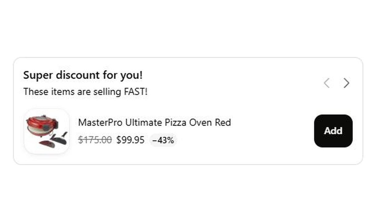
Offer checkout-exclusive savings on recommended products, with per-product discounts and conditions for offers such as free gifts.
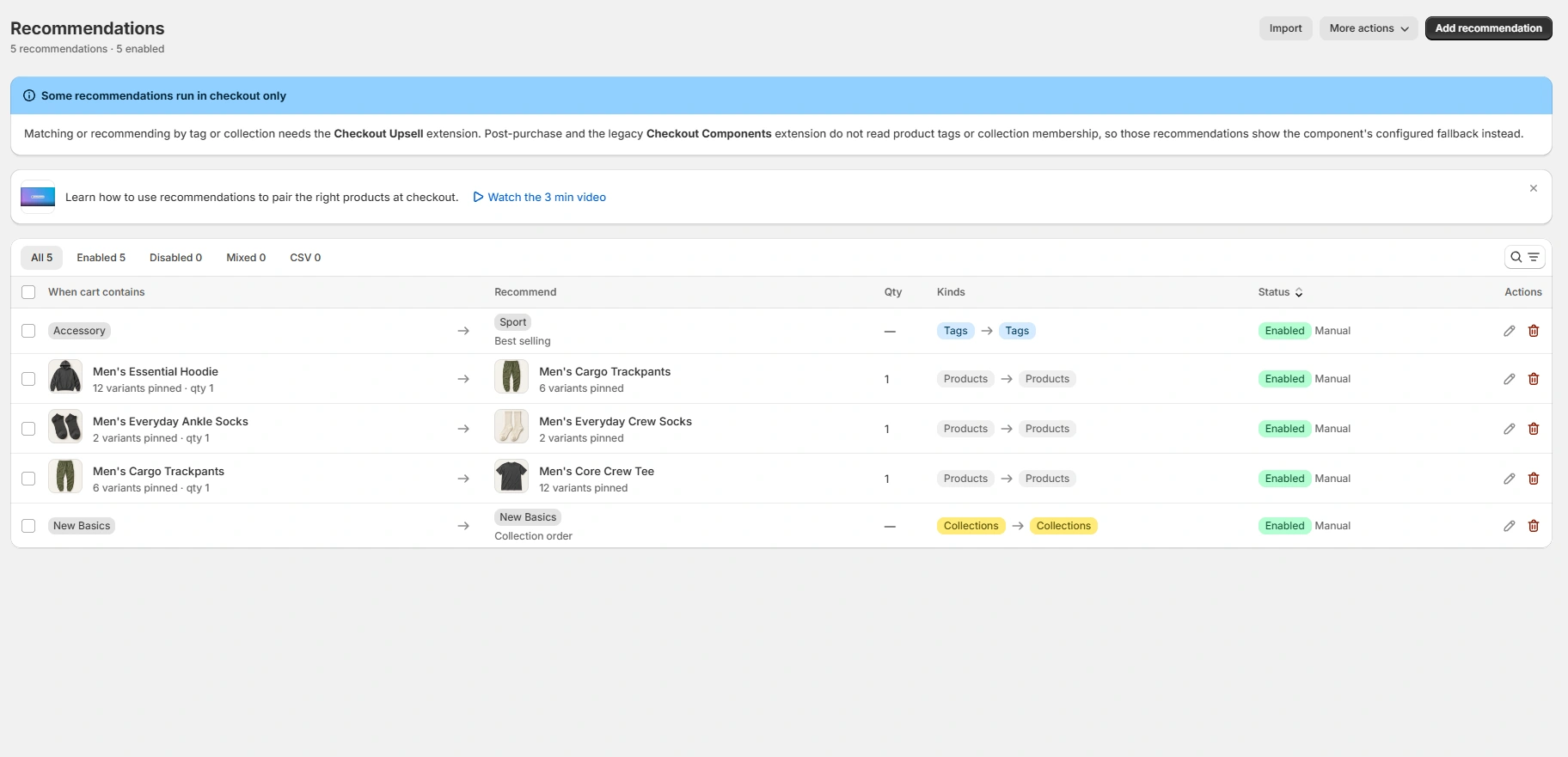
Connect products, tags, and collections in any combination, with up to 1,000 mappings for checkout recommendations.
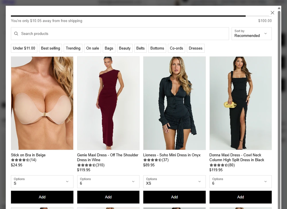
Let customers search products, browse collections, and use price-aware shortcuts to reach free shipping without leaving checkout.
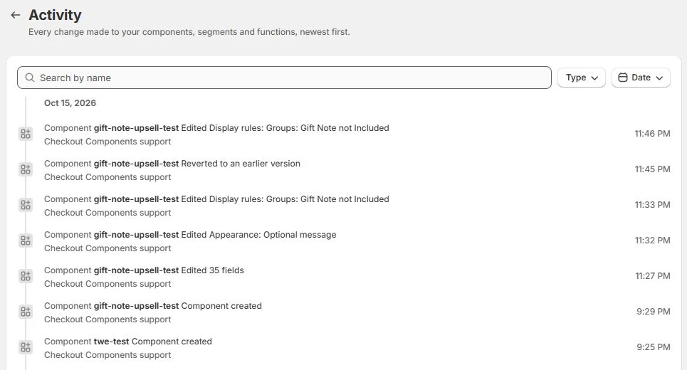
See who changed what and when, roll back to an earlier component version, and view changes alongside checkout analytics.




Recognise visits from supported AI assistants and tailor checkout content to that arrival context.
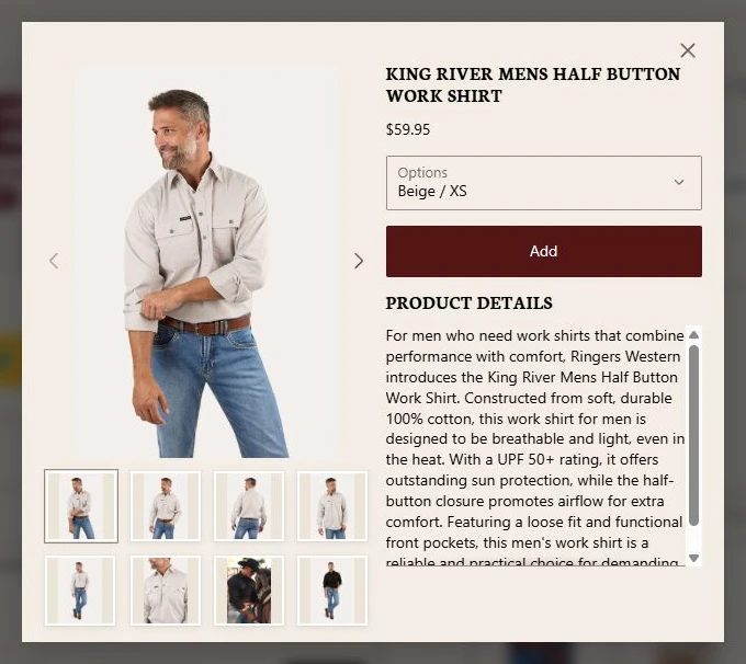
Give customers the information they need to consider an upsell without leaving checkout. They can view a recommended product's images, description, price, and available variants in a modal, then add it to their order without visiting a separate product page.
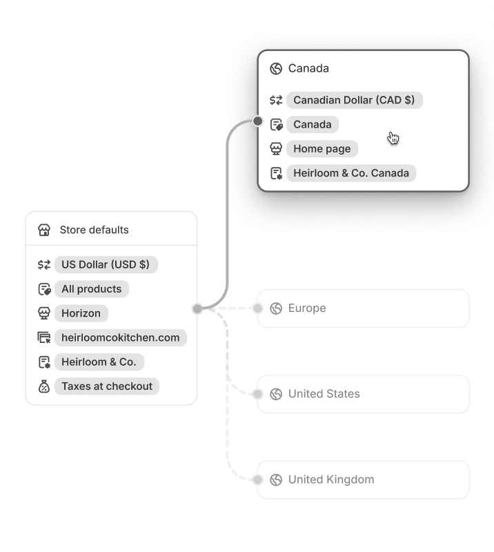
Market targeting controls where a component appears. A component can show across all markets or a selected set. This separates regional availability from language: the market decides who can see it, while translations determine the wording.
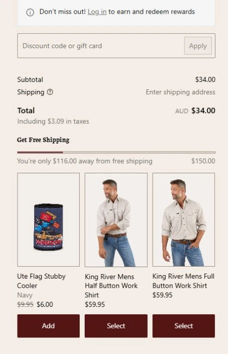
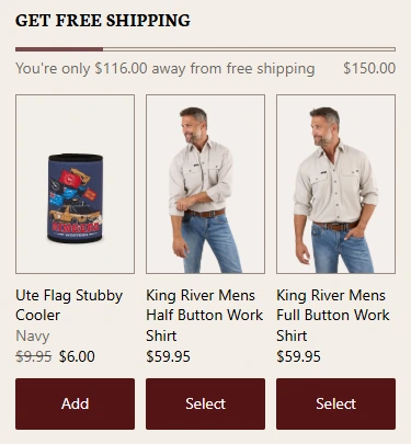
A narrower checkout changes how much content customers can see at once. Use device-specific rendering where available and component-specific mobile settings to choose a presentation that fits, then compare it with the desktop experience.
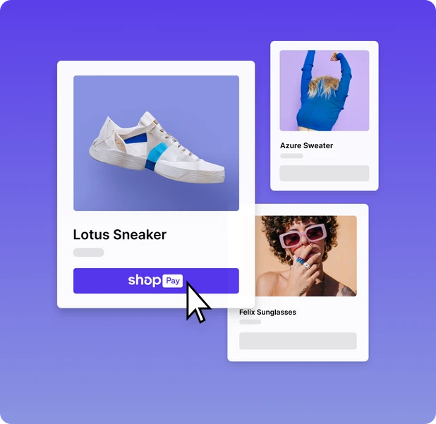
A customer may enter checkout through more than one journey. Shop Pay support should be configured and tested as its own experience, while the Shop app also needs a separate review. Support for one surface is not proof that every component action works identically on another.
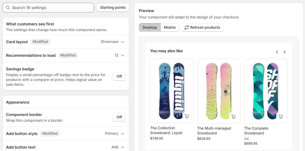
Adjust a component's layout, labels, borders, and behaviour alongside a live desktop or mobile preview. Product cards, messages, and inputs have their own controls, while checkout branding supplies the surrounding fonts and colours. Review the result as you work before publishing it to checkout.
Detect campaign arrivals using UTM source, medium, campaign, term, or content. Match those values in conditional rendering to show relevant messages, offers, or other components, and combine them with cart or customer conditions when the campaign needs a narrower audience.
Features refine individual components. These platform systems connect the broader checkout experience.