Enhancement: A more accurate appearance preview, and settings that are easier to find
The appearance editor has been rebuilt. The preview now matches what checkout actually renders, it points at the part you just changed, and the settings beside it are grouped and searchable instead of being one long list.
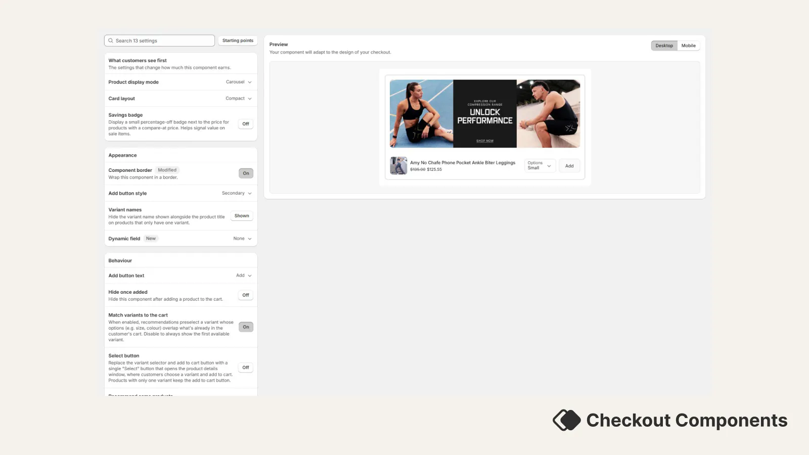
The preview matches checkout more closely. It is now built from the same rules as the component that renders in checkout, layout by layout, so what you see is what your shoppers get. A few of the differences you will notice:
- Prices reflect your discount. If the component has an upsell discount, the preview shows what the buyer actually pays, with the original struck through above it, rather than the plain product price. The savings badge shows the real percentage.
- Variant controls are per product. The variant dropdown, the Select button and the variant name line now appear only on products that genuinely have variants, instead of on whichever card happens to be first.
- Mobile is a real difference, not a smaller picture. Checkout lays a compact card out differently in a narrow space: the card gains a frame, and crowded controls drop to a second row. Switching the preview to mobile now switches to that layout, so you can see the version most of your shoppers will get.
- Progress and thresholds behave properly. On a shipping upsell, the preview drops the products and the progress bar once the threshold is met, the way checkout does, so you can see both states.
- Review stars are clearly examples. When reviews are switched on, the preview spreads sample ratings across the cards and says they are examples, so a five-star card is never mistaken for real data.
It highlights what you changed. When you edit a setting, the part of the component it controls is ringed in the preview. If you are not sure which setting moves the price line, the badge or the variant dropdown, change it and watch where the ring lands.
Options are easier to find. Settings are grouped, with the ones you are most likely to want first, then Appearance and Behaviour underneath. There is a search box at the top, so typing "button" or "badge" takes you straight there. Anything you have moved away from its default is tagged Modified, so you can see at a glance what this component does differently.
Nothing saves until you say so. Edits are held as a draft and the save bar appears while you have unsaved changes, so you can try a few combinations and leave without keeping any of them.
While you are still creating a component. The same editor and preview are available before a component is saved, so you can set the look up front rather than creating the component first and styling it afterwards.
Existing setups. Your current components and their settings are unchanged. The editor reads and writes the same settings as before, so a component you styled previously opens exactly as you left it. If a component looks different in the preview than it used to, the preview is the thing that changed, not your component.