New Feature: Starting points give a component a working look in one click
A new component no longer starts from a blank set of settings. Pick a starting point and it fills in a handful of appearance settings for you, so you begin from something that already looks right.
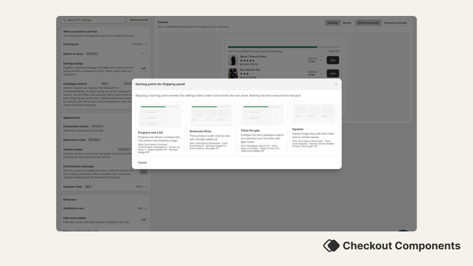
What's new. The first time you open the appearance editor on a component you have not styled yet, you are offered a small gallery of starting points for that component type. A carousel upsell can start as Compact, Showcase, Squares or Simple. A checkbox upsell can start With thumbnail or as One line. Each one is a named look, not a theme.
You can see what it will do before you pick. Every starting point is drawn as a small wireframe of the layout and lists the settings it will set, so there is no guessing and no waiting for images to load.
It writes settings, then gets out of the way. Applying a starting point sets the settings listed under it and leaves everything else alone. After that, nothing ties the component to your pick: there is no theme to stay in sync with, and every setting is yours to change. The Modified badges carry on comparing against the normal defaults.
You can skip it, or come back to it. Choose Start from defaults to go straight to the settings. Starting points stay available afterwards from the appearance editor, so you can try a different look later.
Existing setups. Existing components get this too, not just new ones. Anything you set up before today can be moved onto one of these looks the same way.