Checkbox.
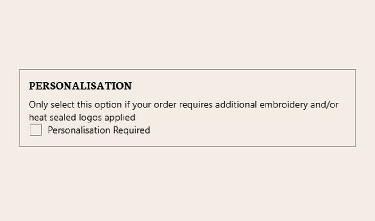

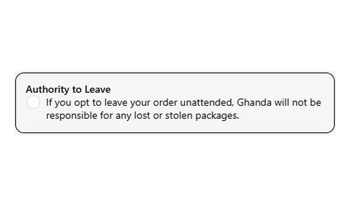

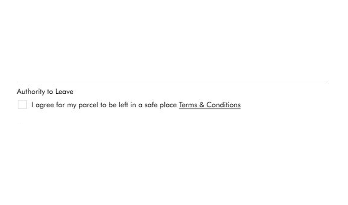

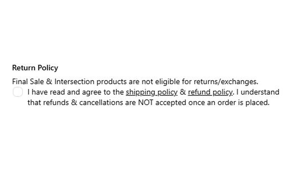

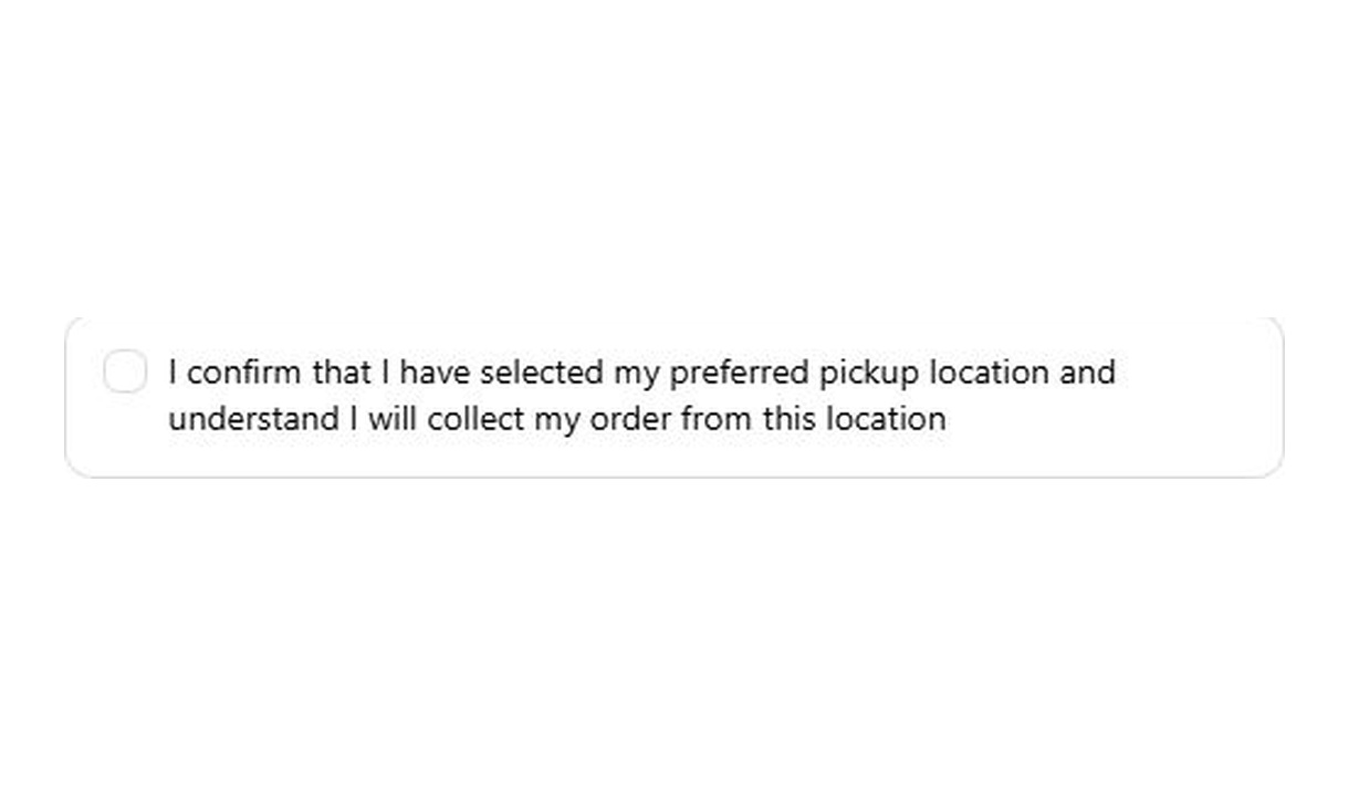

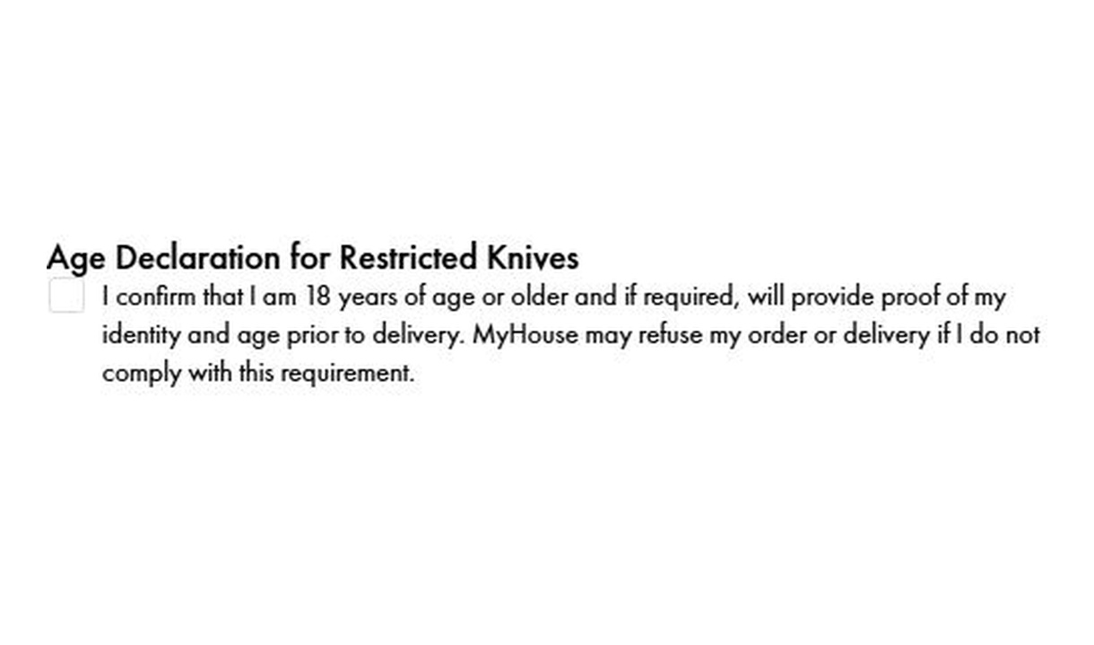
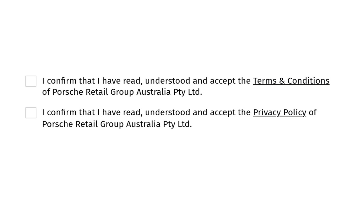
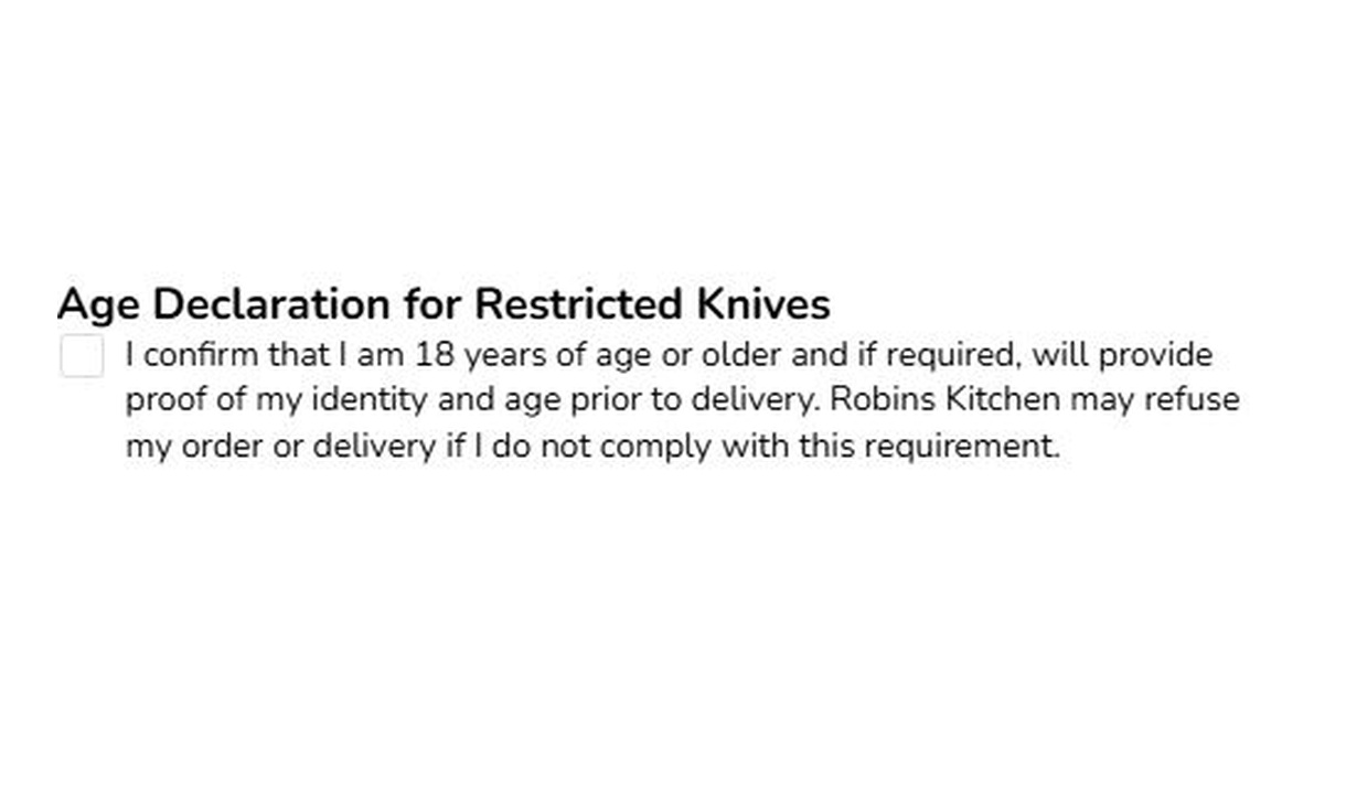
Collect an acknowledgement or a simple preference at checkout. Use checkboxes for terms, delivery permission, or instructions tied to selected products.
For Shopify Plus Checkout
See it in checkout.
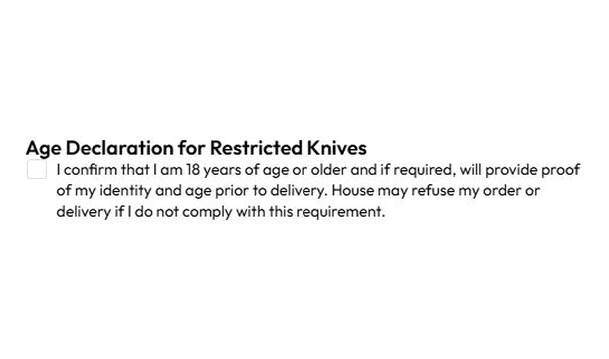

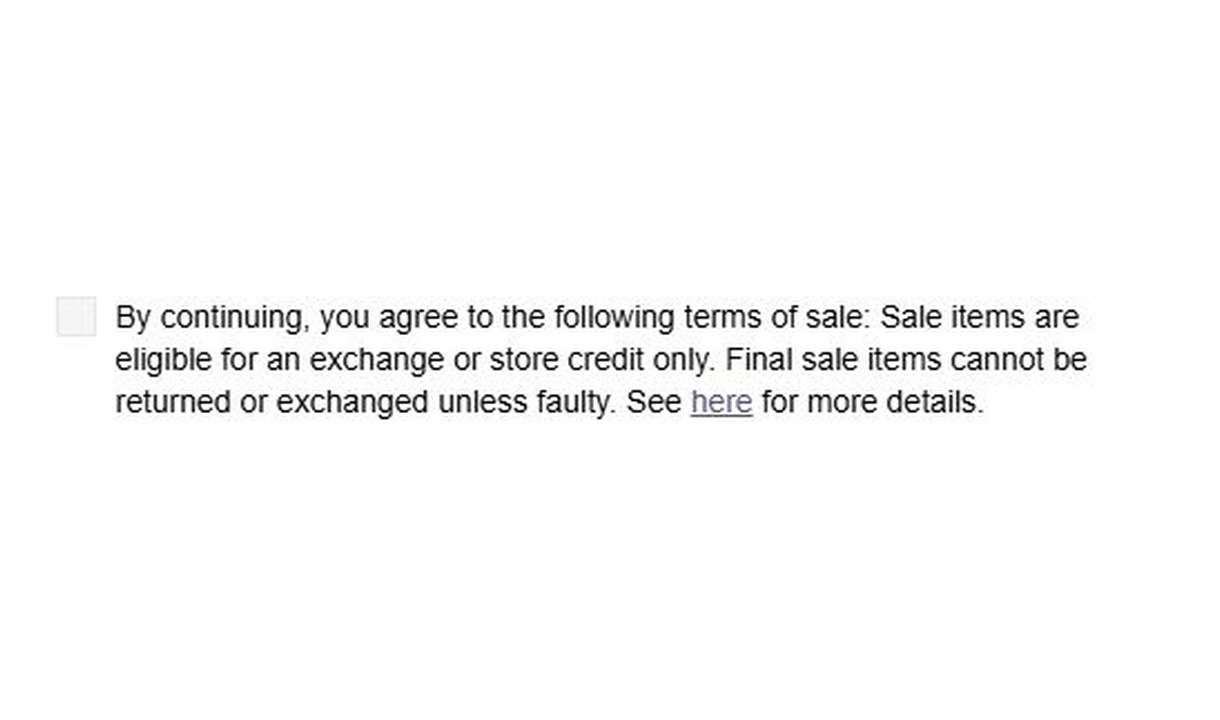

More merchant examples (10)
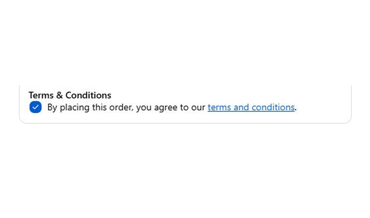







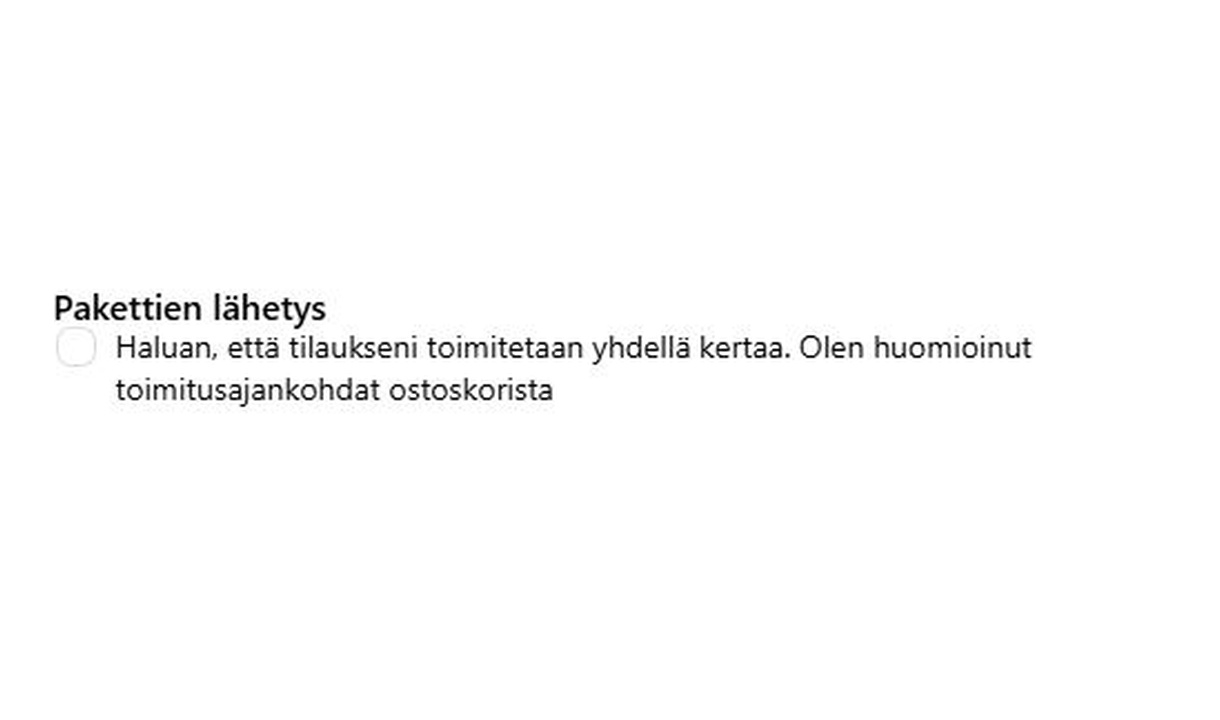

Configure your component.
Write the label and field key
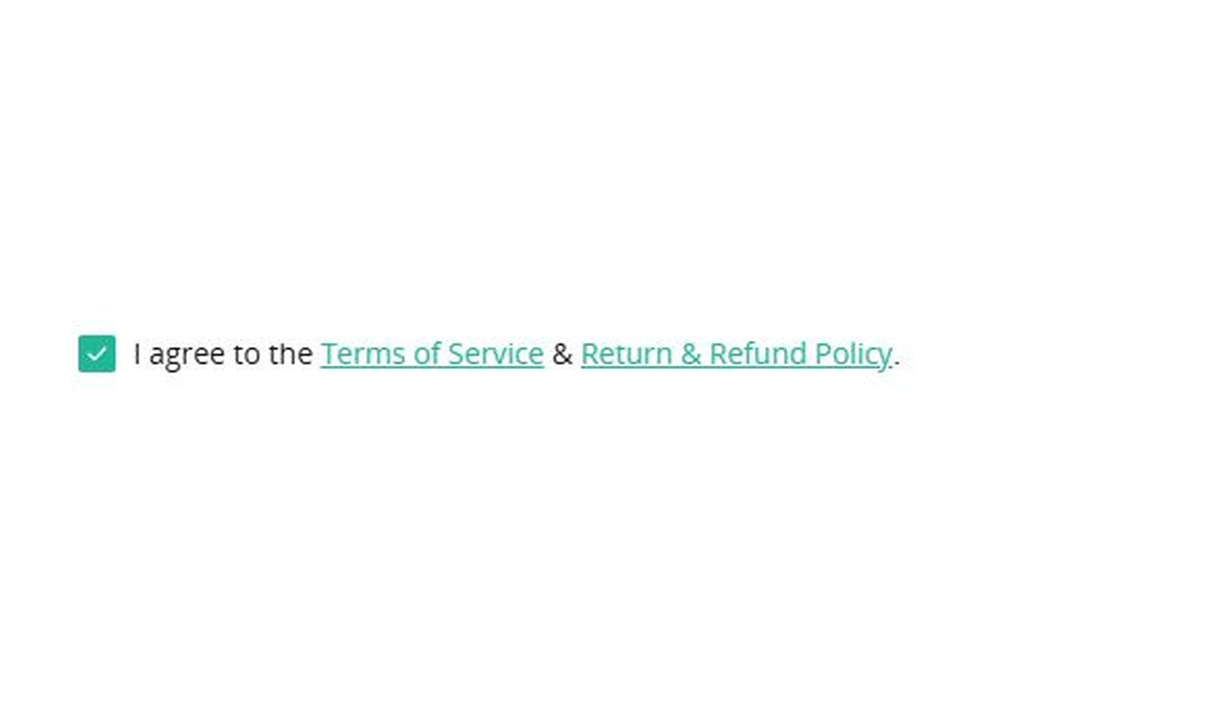
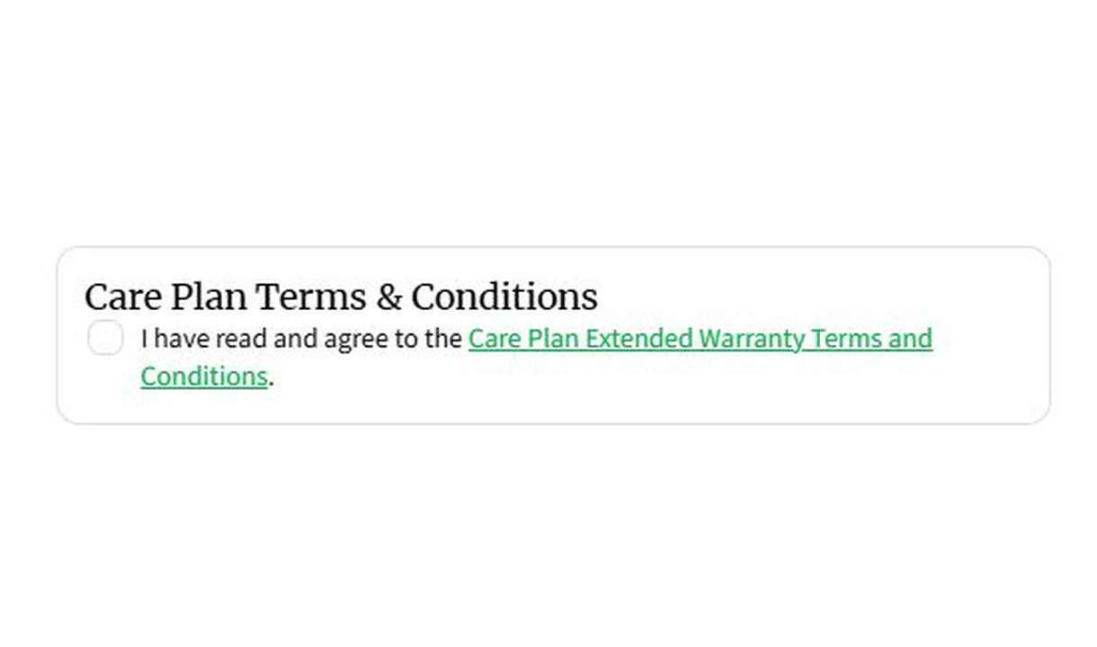
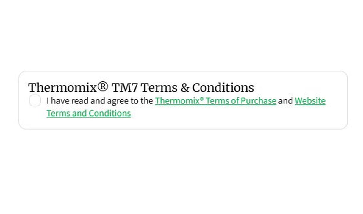
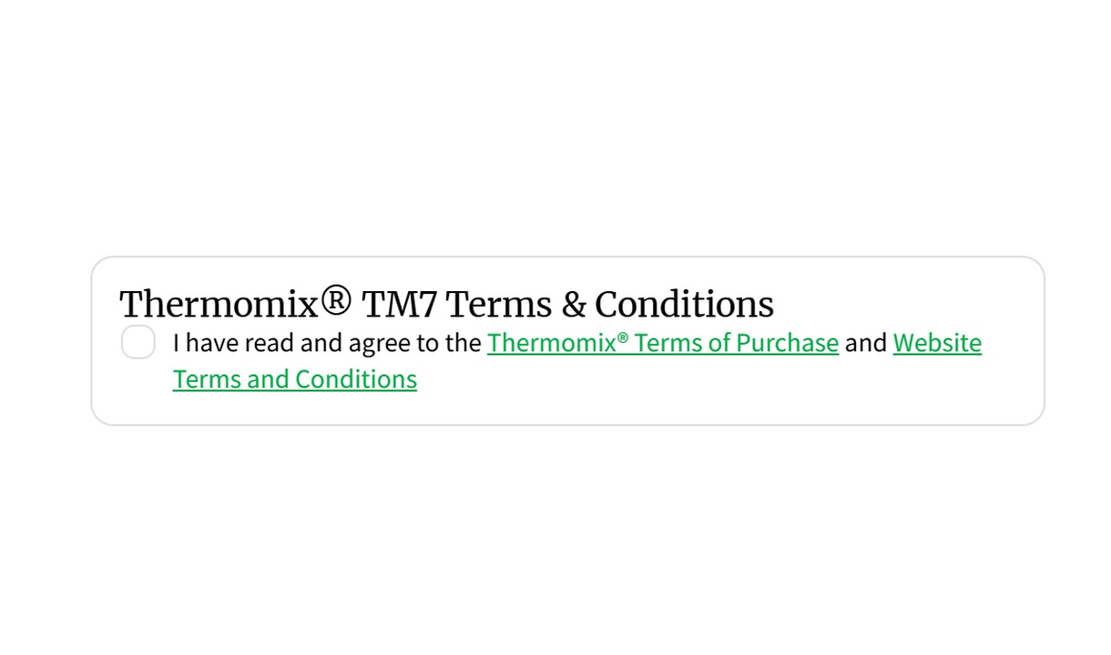
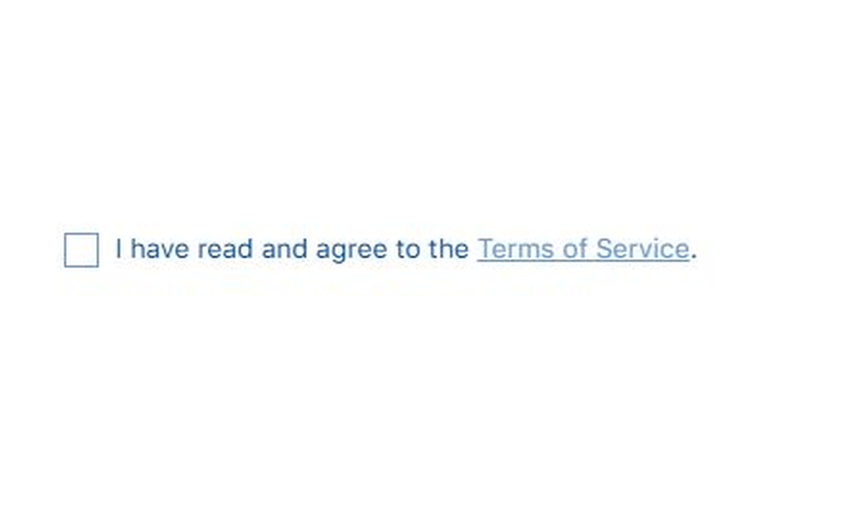
Checkbox labels support links and text emphasis using markdown. Keep the customer-facing acknowledgement separate from the internal key used to save the response.
Choose required and default states
A required checkbox must be selected before the customer can continue. The separate precheck setting starts it selected, and customers can uncheck it. Choose the default deliberately for the information you are collecting.
Control its presentation
Place the checkbox inside a banner when it needs more prominence. Use component conditions to show it only for matching carts, products, or customer groups.
Choose where the response is saved
Save responses to an order attribute, a metafield, or an order note. Give each field a key that your fulfilment tools can recognise. Order note storage is available for a single field; use attributes or metafields when combining multiple fields.
Configure the acknowledgement itself, its starting state, and whether it must be selected to continue. A checkbox can stand alone, appear inside a banner, or form part of a group of inputs. Store the response with the order instead of relying on the visible label alone.
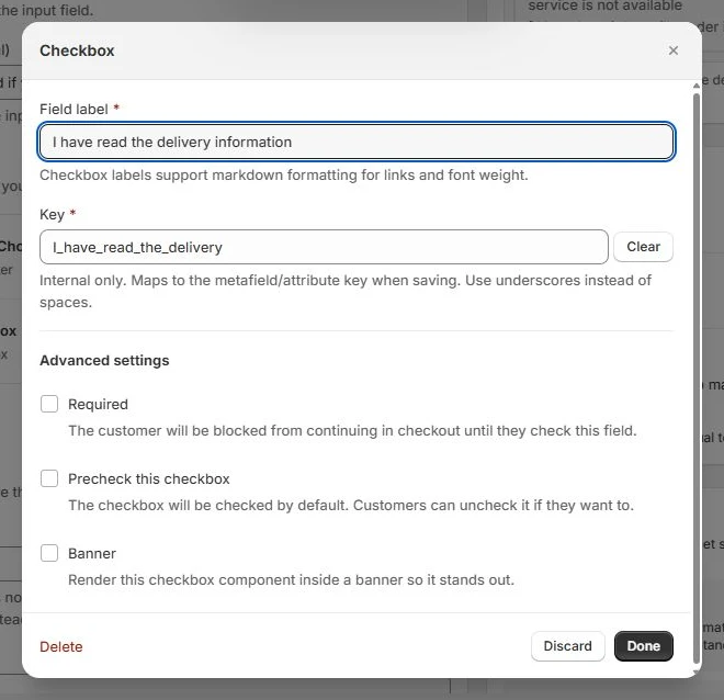
The tools behind your components.
Connect content, audience, and presentation controls. Available settings depend on the component and its version.
Good together.
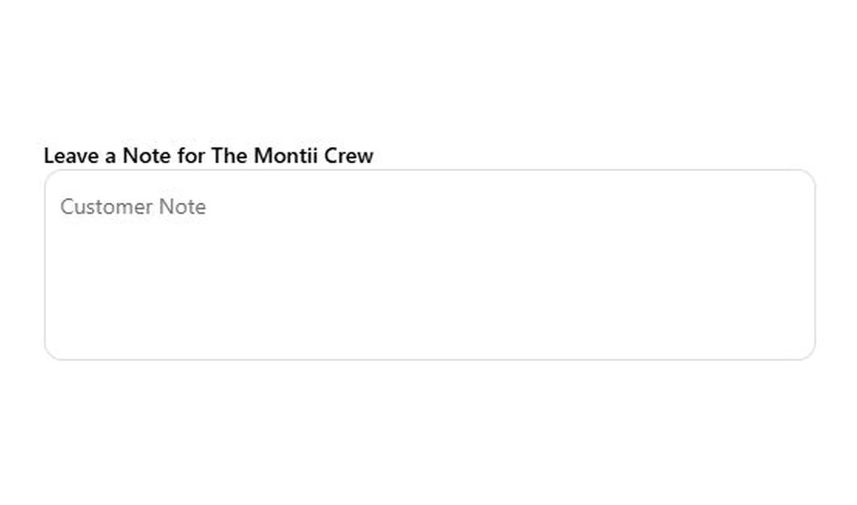
Text field
Collect gift messages, delivery instructions, and order notes in Shopify checkout. Give customers a clear place to add the details your team needs.
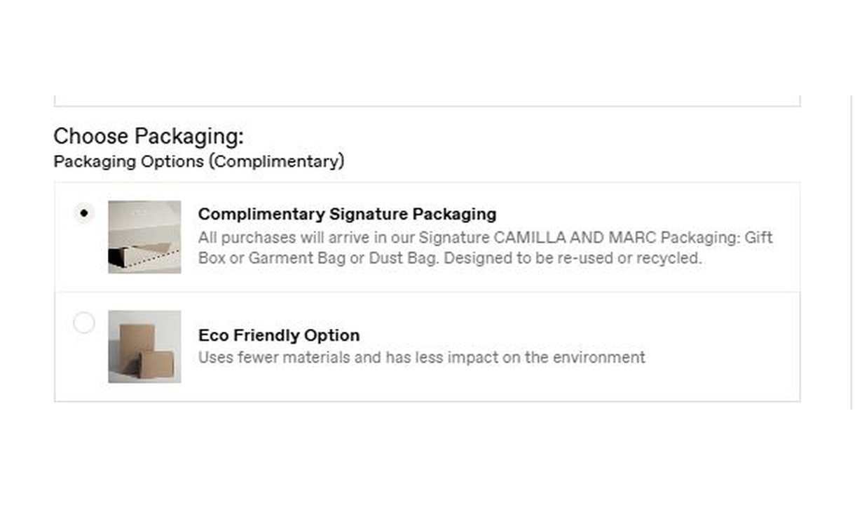
Radio buttons
Let customers choose one option from a visible set in Shopify checkout. Collect packaging choices, delivery preferences, or another structured response.
Your questions, answered.
How is a custom checkbox different from Checkbox upsell?
A custom checkbox records a yes-or-no response or acknowledgement. Checkbox upsell adds a product-based extra to the cart. Choose the input when you need information rather than another purchase.
Can a required checkbox stop checkout until selected?
Yes. When the checkbox is required, the customer must select it before checkout can continue. Use clear wording about the acknowledgement you need.
Can a checkbox start selected?
Yes. Precheck this checkbox controls the initial selection and is separate from Required. Customers can uncheck a preselected field; choose the default deliberately for the information being collected.
Can I link to terms or highlight the checkbox?
Yes. Checkbox labels support Markdown links and emphasis, and the checkbox can appear inside a banner. Keep the linked information accessible before the customer makes a choice.
Can a checkbox reveal additional fields?
Yes. Optional input groups can sit behind a checkbox, such as Add a gift message. The extra fields stay hidden until the customer selects the option.
Where are custom field responses saved?
Choose an order attribute, a metafield, or an order note, and give each field a recognisable key. Order note storage is for a single field; use attributes or metafields for multiple fields. Confirm that your packing-slip or fulfilment app reads the chosen location.
How do I add a custom field to Shopify checkout?
Create and name the input component in Checkout Components. Add the Latest Custom Field block in Shopify's checkout editor and enter that component name in the block settings. Choose one of the placements Shopify makes available and preview it before publishing.
Can I show the component only to certain customers or carts?
Yes. Use display rules based on products, cart value or quantity, customer tags, markets, or delivery details. Combine conditions with all or any logic and test representative carts before publishing.
Do I need Shopify Plus, and which app plan includes this component?
Yes. Checkout Components is built for Shopify Plus stores. Starter includes one content or input component; Growth and above include unlimited content and input components. Translations and thank-you page content are included on Growth and above.