Date picker.
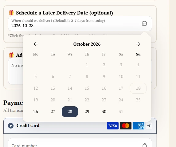

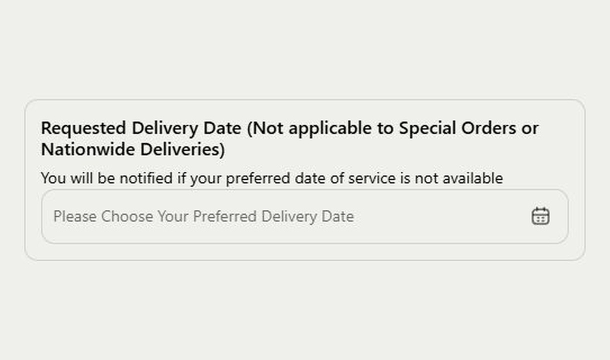

Collect a preferred delivery or event date in Shopify checkout. Give customers a calendar-based input with clear wording about availability.
For Shopify Plus Checkout
Configure your component.
Define the field
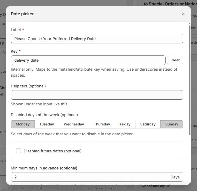
Set the customer-facing label, an internal field key, and optional help text. Explain whether the date is a preference or a confirmed commitment.
Set the available dates
Disable selected days of the week and set a minimum number of days in advance. A buffer of 2 blocks today and the following day; 0 or an empty buffer allows today. You can also prevent future-date selection when collecting a past date.
Make the response required
Choose whether customers must complete the date field before continuing in checkout. Use conditional rendering to show it only for the relevant products, customers, or delivery methods.
Choose where the response is saved
Save responses to an order attribute, a metafield, or an order note. Give each field a key that your fulfilment tools can recognise. Order note storage is available for a single field; use attributes or metafields when combining multiple fields.
Control the dates a customer can choose, not just the wording above the calendar. Set a preparation buffer, exclude recurring weekdays, and decide whether a date is required. Save the selection with the order so your team can use it in their delivery or fulfilment workflow.
The tools behind your components.
Connect content, audience, and presentation controls. Available settings depend on the component and its version.
Good together.
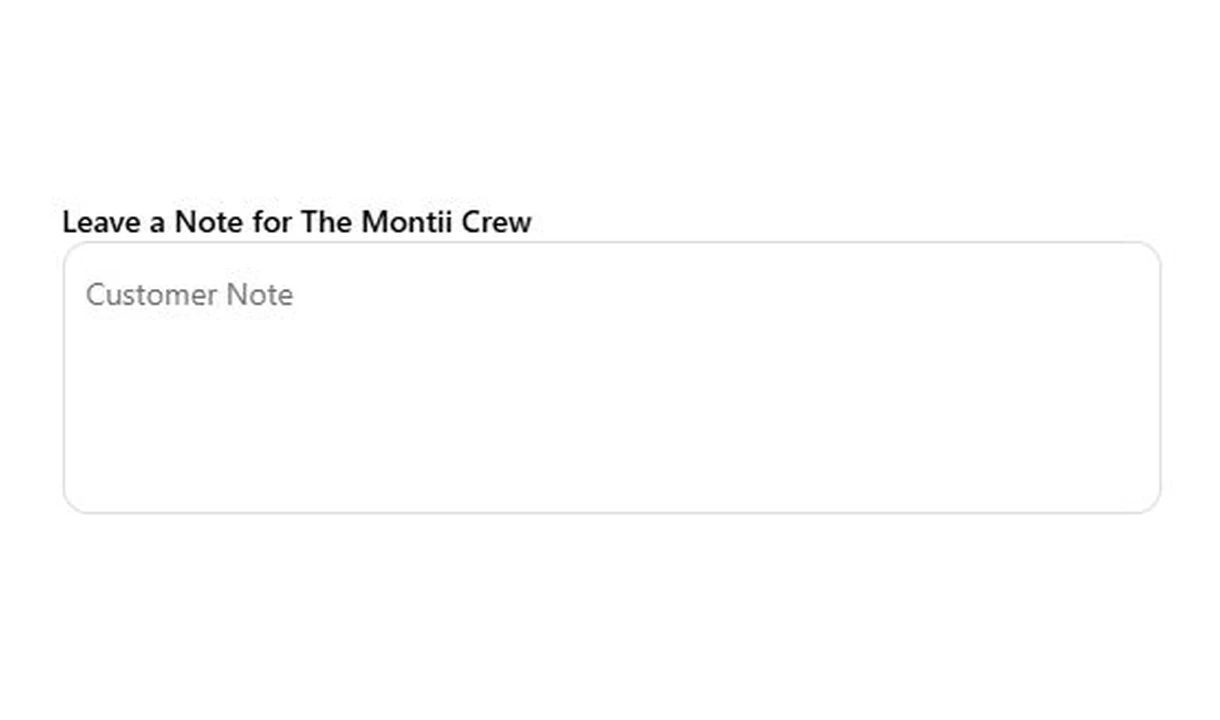
Text field
Collect gift messages, delivery instructions, and order notes in Shopify checkout. Give customers a clear place to add the details your team needs.
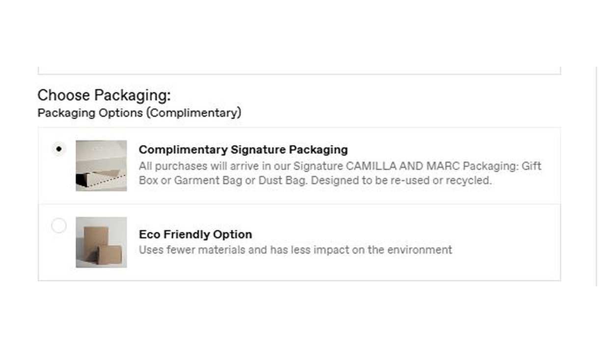
Radio buttons
Let customers choose one option from a visible set in Shopify checkout. Collect packaging choices, delivery preferences, or another structured response.
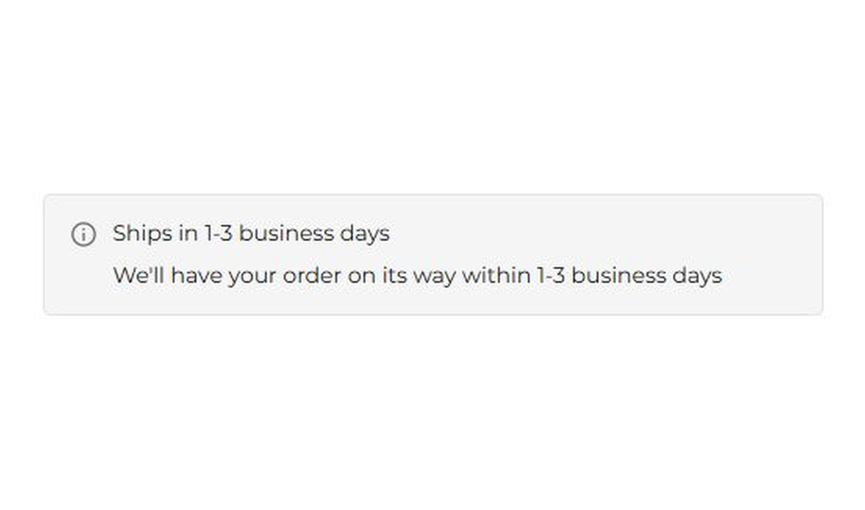
Banner
Keep customers informed before they order. Highlight dispatch delays, free shipping, and other important checkout alerts.
Your questions, answered.
What can I use a date picker for in Shopify checkout?
Collect a preferred delivery or pickup date, an event date, or another date your order workflow needs. Explain whether the selection is a request or a confirmed commitment.
Can I block weekdays and allow preparation time?
Yes. Choose unavailable weekdays and set Minimum days in advance. For example, a buffer of two blocks today and the following day. These rules do not connect the field to live delivery-slot availability.
Does selecting a date book a delivery slot?
No. The component collects the requested date. Your separate fulfilment or scheduling workflow must confirm availability and any delivery promise.
Can I require a date before customers continue?
Yes. Make the date field required and use display rules to show it only for the relevant products, customers, or shipping methods.
Will my fulfilment team receive the selected date?
The date is saved using your chosen storage method. Check that the fulfilment or shipping system reads that field and acts on it before publishing the date picker.
Where are custom field responses saved?
Choose an order attribute, a metafield, or an order note, and give each field a recognisable key. Order note storage is for a single field; use attributes or metafields for multiple fields. Confirm that your packing-slip or fulfilment app reads the chosen location.
How do I add a custom field to Shopify checkout?
Create and name the input component in Checkout Components. Add the Latest Custom Field block in Shopify's checkout editor and enter that component name in the block settings. Choose one of the placements Shopify makes available and preview it before publishing.
Can I translate the component into multiple languages?
Yes, on Growth and above. Add translations for the languages your store supports. Text without a translation uses your default wording; text embedded in uploaded images needs separate translated artwork.
Do I need Shopify Plus, and which app plan includes this component?
Yes. Checkout Components is built for Shopify Plus stores. Starter includes one content or input component; Growth and above include unlimited content and input components. Translations and thank-you page content are included on Growth and above.