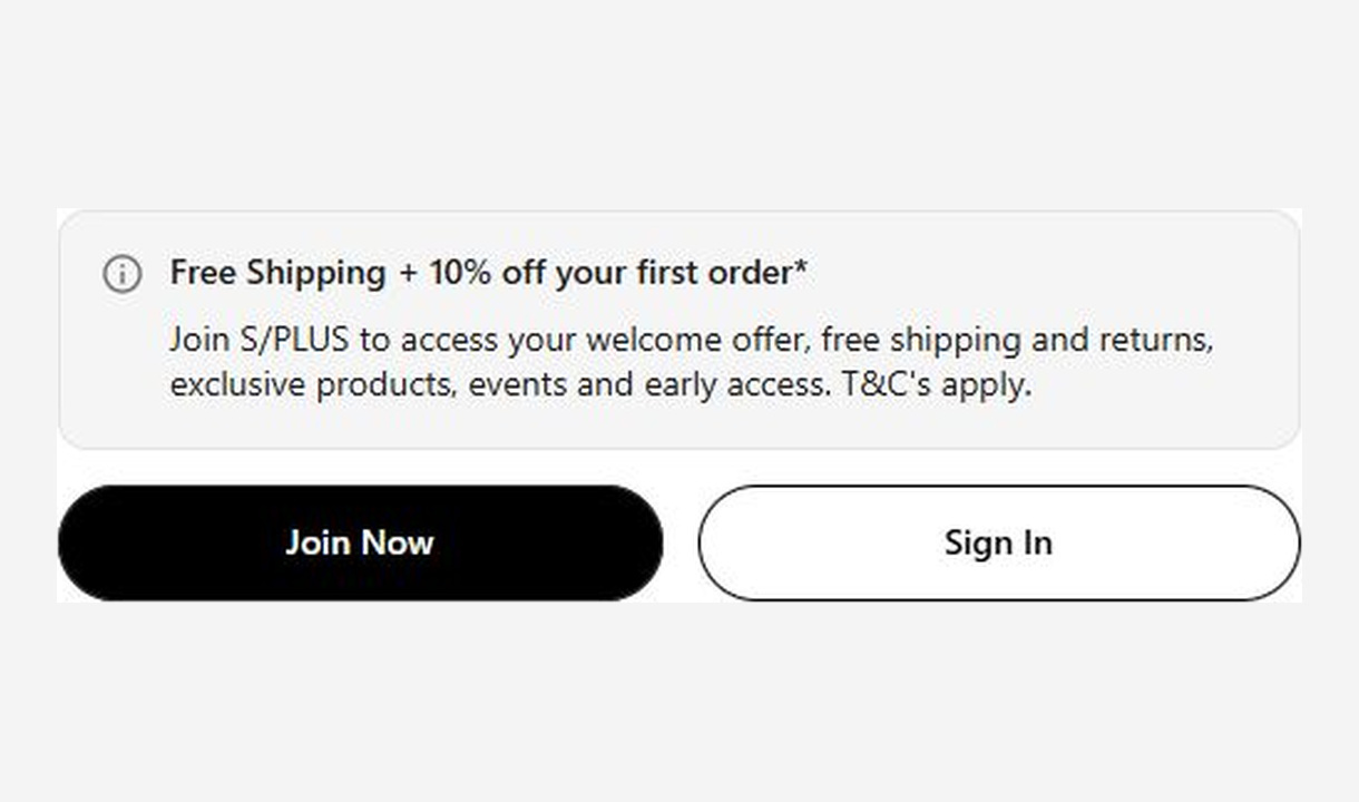
Call to action.
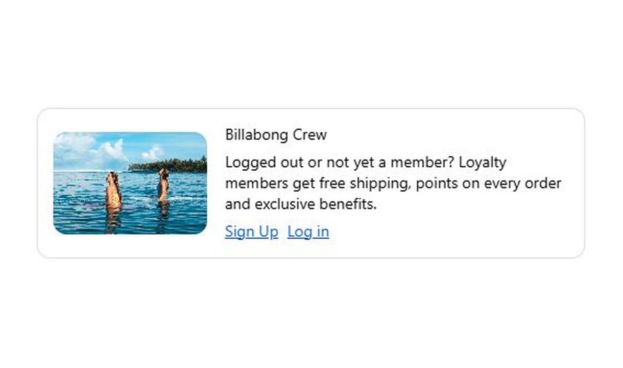

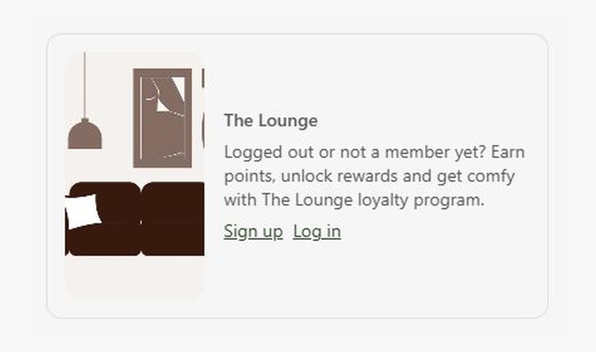

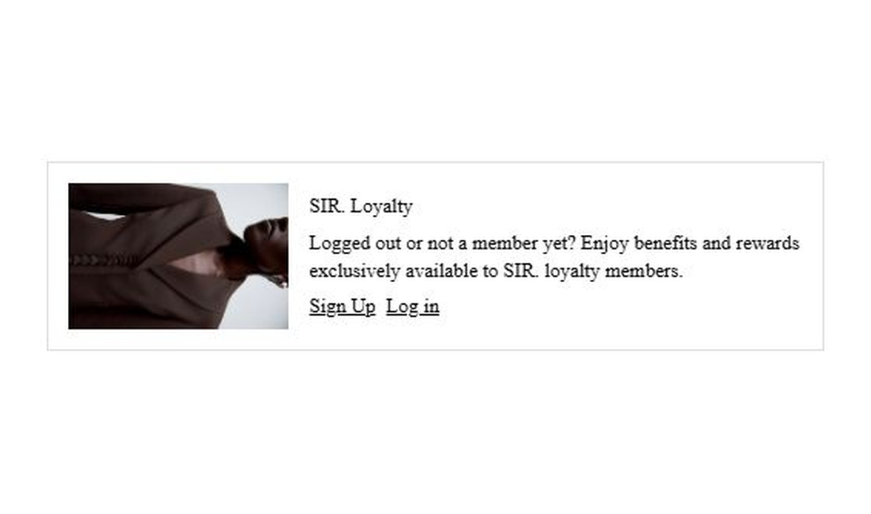

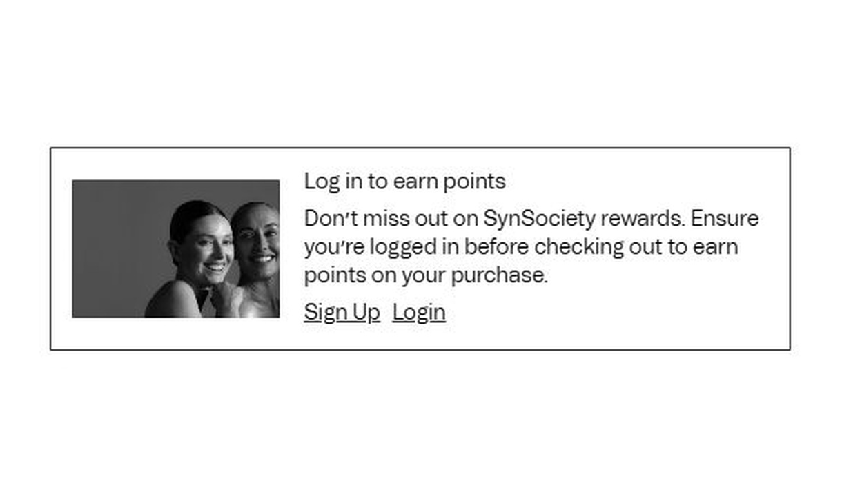

Invite guest shoppers to join your loyalty programme or log in. Give customers a clear next step with a targeted checkout button.
For Shopify Plus Checkout
Configure your component.
Choose the destination
Link to your loyalty sign-up, login page, or another relevant destination.
Make the next step clear
Choose a clear label, such as Join or Log in, with primary or secondary styling.
Show it to guest shoppers
Use rendering conditions to show the prompt to guests, or choose another audience for a different use.
Use a call to action to bring guest shoppers into your loyalty programme or prompt existing members to log in. Set conditions to show it only to guests. The same linked button can also point to support or another useful destination.
The tools behind your components.
Connect content, audience, and presentation controls. Available settings depend on the component and its version.
Good together.
Help buttons
Put support destinations within reach at Shopify checkout with configurable help buttons for contact options and frequently asked questions.
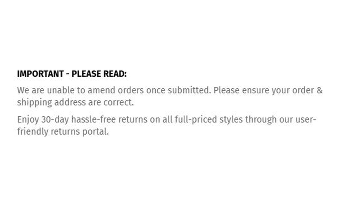
Simple message
Give customers the information they need to keep going. Share short support, order, or brand messages without adding clutter to checkout.
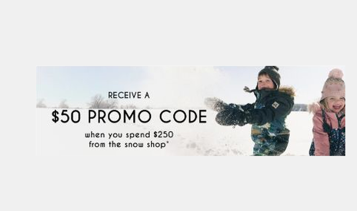
Image banner
Add branded or promotional imagery to Shopify checkout with an image banner and an optional link to further information.
Your questions, answered.
What does a checkout call-to-action button do?
It links customers to a destination you configure, such as loyalty sign-up, account login, a sizing guide, or support. Choose primary or secondary button styling and a clear label.
Can I show a loyalty sign-up button only to guests?
Yes. Use rendering conditions to show the prompt to guest checkouts. You can target a different audience for another destination, such as information for existing members.
Does the button enrol customers or replace Shopify's payment button?
No. It is a link to another destination. It does not complete enrolment, submit a custom server action, or replace Shopify's payment button.
When should I use Help buttons instead?
Use Call to action for one clear next step. Use Help buttons to group several support routes, such as phone, email, and a delivery FAQ.
Can I translate the component into multiple languages?
Yes, on Growth and above. Add translations for the languages your store supports. Text without a translation uses your default wording; text embedded in uploaded images needs separate translated artwork.
Will the component match my Shopify checkout branding?
Yes. Components use Shopify's checkout elements and inherit your checkout's fonts, colours, and styling. Use the component's appearance controls for the presentation options available to that component.
Can I show it only on mobile or desktop?
Yes. In the matching Latest block in Shopify's checkout editor, set Show on devices to all, mobile, or desktop. Check the result in the editor's device previews before publishing.
Do I need Shopify Plus, and which app plan includes this component?
Yes. Checkout Components is built for Shopify Plus stores. Starter includes one content or input component; Growth and above include unlimited content and input components. Translations and thank-you page content are included on Growth and above.