Help buttons.
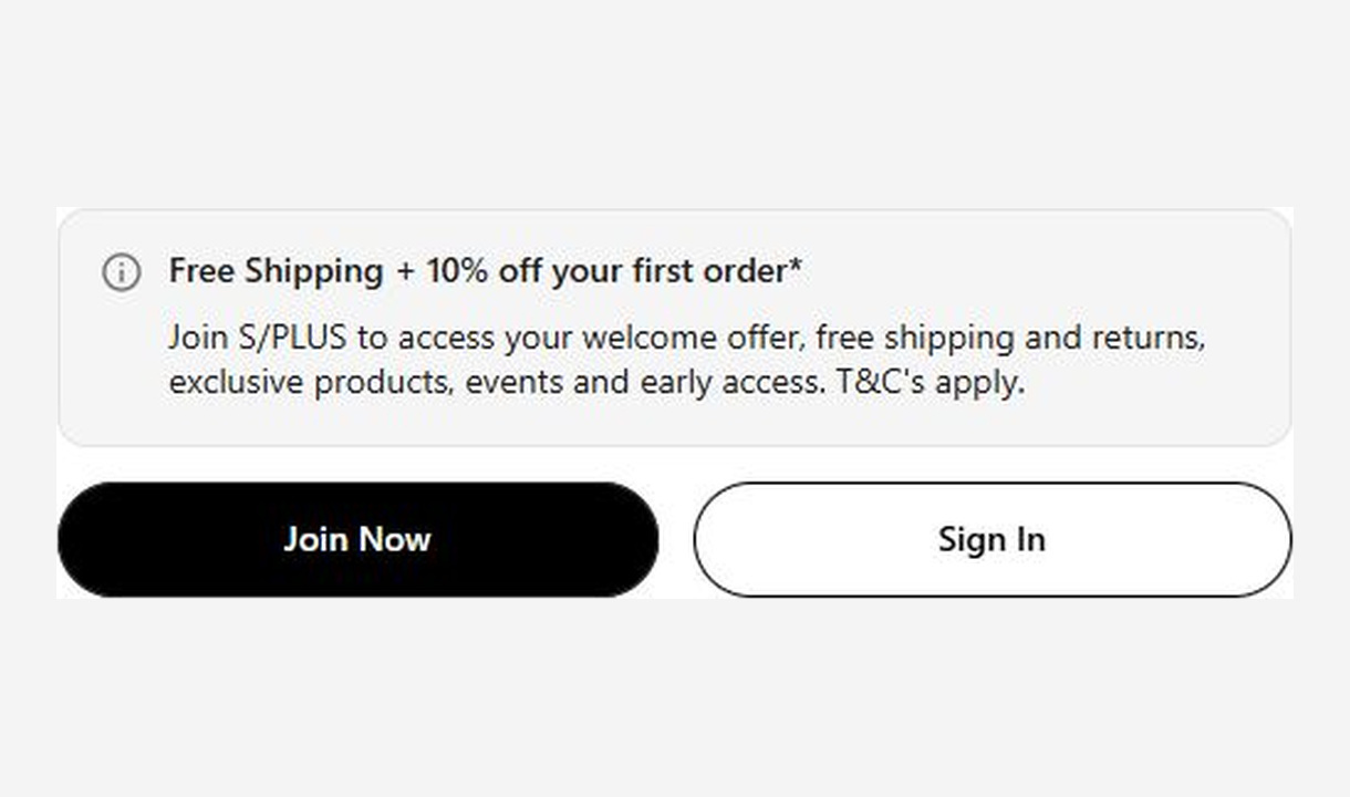

Put support destinations within reach at Shopify checkout with configurable help buttons for contact options and frequently asked questions.
For Shopify Plus Checkout
Configure your component.
Choose the support routes
Configure destinations such as a support page, phone contact, or FAQ.
Explain each option
Give each button a clear label so customers know how they can get help.
Keep expectations accurate
Match the visible wording to the availability and response expectations of your support team.
Help buttons group routes to assistance in one place. They suit checkout questions about delivery, product choice, or the order itself, using the support channels your business already provides.
The tools behind your components.
Connect content, audience, and presentation controls. Available settings depend on the component and its version.
Good together.
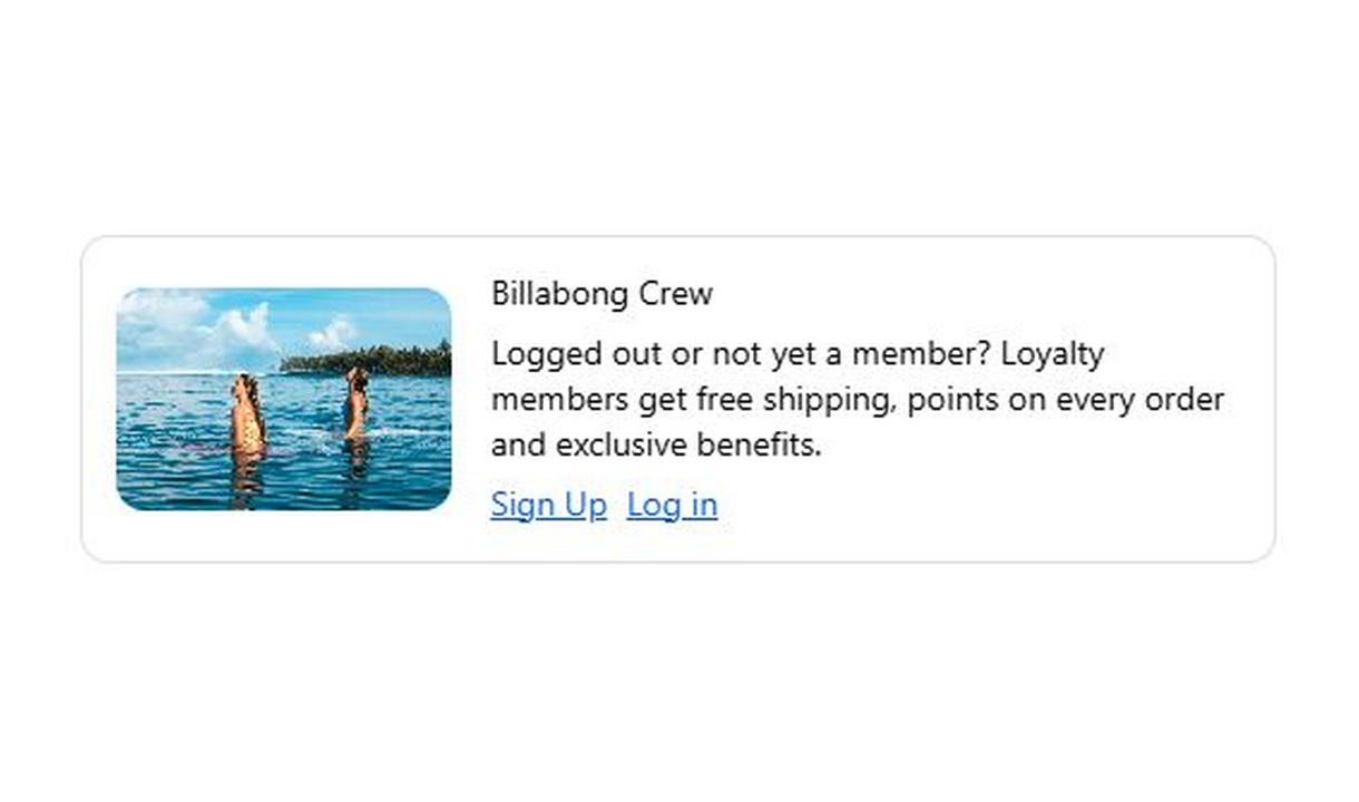
Call to action
Invite guest shoppers to join your loyalty programme or log in. Give customers a clear next step with a targeted checkout button.
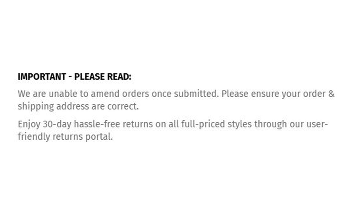
Simple message
Give customers the information they need to keep going. Share short support, order, or brand messages without adding clutter to checkout.
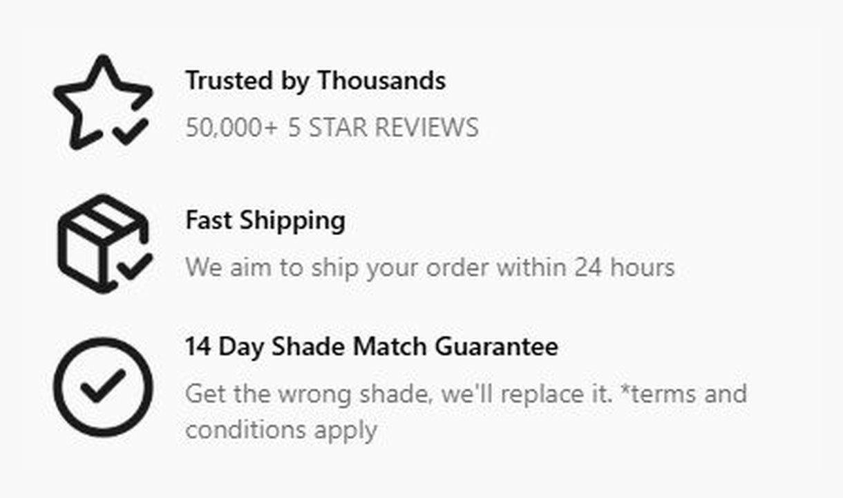
Callout
Give customers a reason to complete their order. Highlight brand benefits or explain a promotion, with more room than a trust badge.
Your questions, answered.
What can checkout Help buttons link to?
Link to your configured support destinations, such as phone, email, a live-chat entry point, or an FAQ page. Use clear labels so customers know what happens when they choose a button.
Do Help buttons provide a live-chat service?
No. They link to the channels you configure. Your chat service, support team, and contact workflow must be set up separately.
Will every help destination stay inside checkout?
No. A destination may open another page or app, depending on the link and the customer's device. Test each destination and avoid promising an in-checkout experience for every channel.
Can I show different support options to different markets?
Yes. Use market or country conditions for local support information. Keep visible phone numbers, operating hours, and response expectations accurate for that audience.
How is Help buttons different from Call to action?
Help buttons groups support routes in one place. Call to action is for a single next step, such as visiting a loyalty sign-up page.
Can I translate the component into multiple languages?
Yes, on Growth and above. Add translations for the languages your store supports. Text without a translation uses your default wording; text embedded in uploaded images needs separate translated artwork.
Can I show it only on mobile or desktop?
Yes. In the matching Latest block in Shopify's checkout editor, set Show on devices to all, mobile, or desktop. Check the result in the editor's device previews before publishing.
Do I need Shopify Plus, and which app plan includes this component?
Yes. Checkout Components is built for Shopify Plus stores. Starter includes one content or input component; Growth and above include unlimited content and input components. Translations and thank-you page content are included on Growth and above.