Callout.
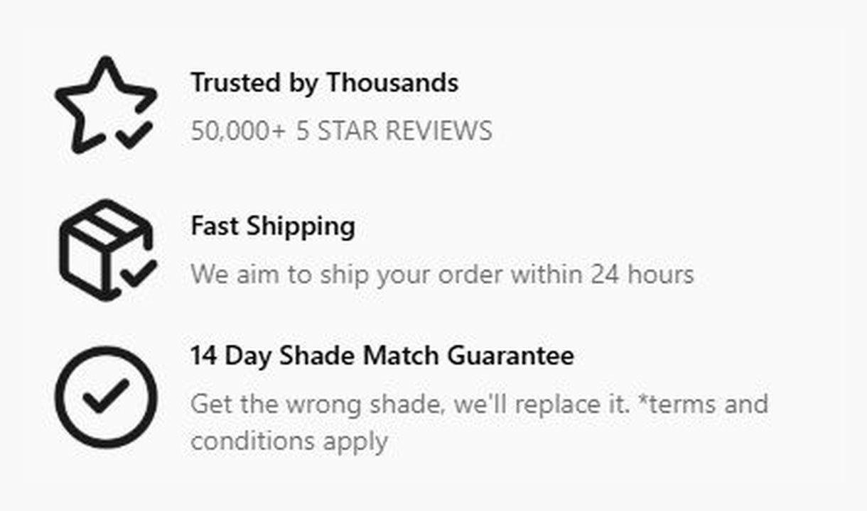

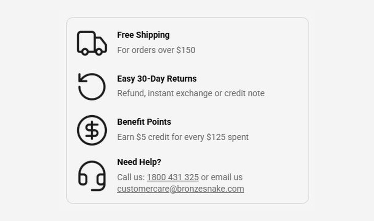

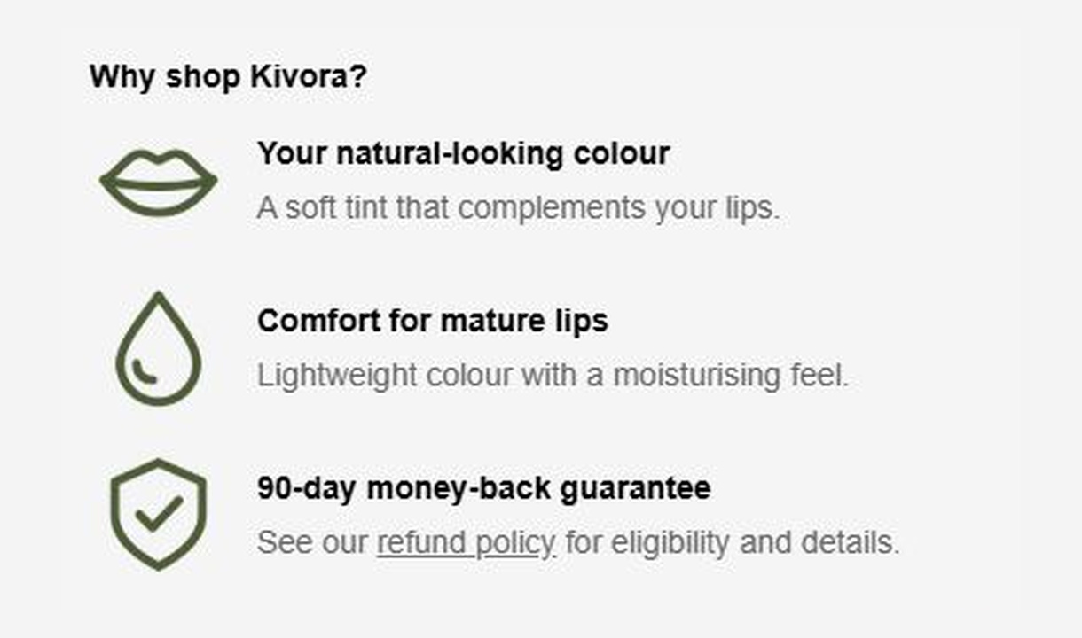

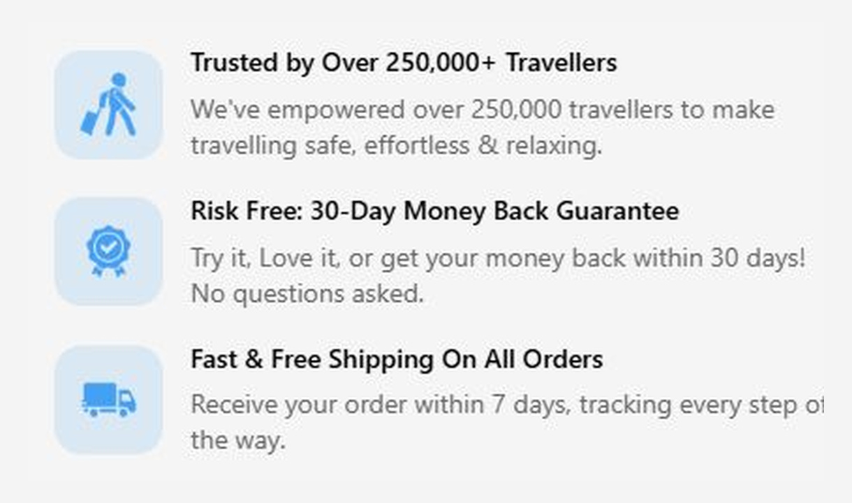

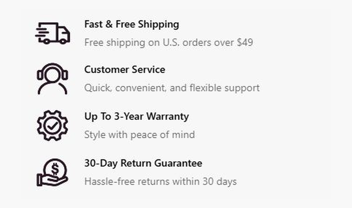

Give customers a reason to complete their order. Highlight brand benefits or explain a promotion, with more room than a trust badge.
For Shopify Plus Checkout
See it in checkout.

Configure your component.
Choose your reason to buy
Explain a brand benefit or give customers the details of an offer.
Add visual context
Pair your message with an icon and style it to suit your checkout.
Make it relevant
Show different callouts based on cart contents, customer segments, or markets.
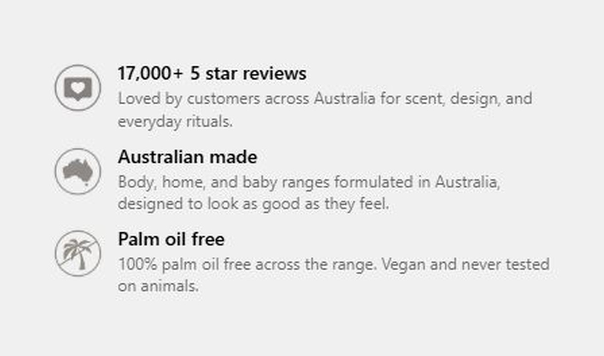
Use a callout when a badge needs a little more explanation. Pair an icon with reasons to buy from your brand or details of a promotion. Personalise what customers see using cart contents, customer segments, and other conditions.
The tools behind your components.
Connect content, audience, and presentation controls. Available settings depend on the component and its version.
Good together.
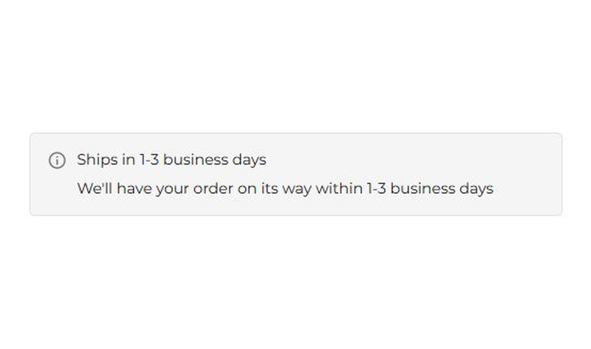
Banner
Keep customers informed before they order. Highlight dispatch delays, free shipping, and other important checkout alerts.
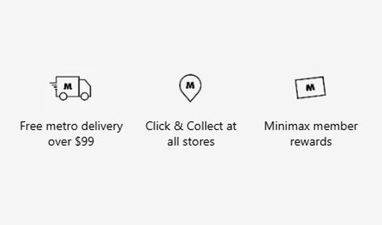
Trust badges
Show the reassurance that matters to each customer. Personalise trust badges around their cart, customer segment, or market.
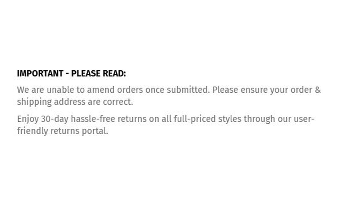
Simple message
Give customers the information they need to keep going. Share short support, order, or brand messages without adding clutter to checkout.
Your questions, answered.
How is a callout different from a banner or trust badge?
A callout gives an icon-led benefit or promotion more room for explanation. A banner communicates one alert, while a trust badge pairs an icon with a shorter reassurance message.
Can I group several callouts together?
Yes. Group related points, such as product quality, service, and a guarantee. Keep each point concise so customers can scan the group without losing focus on the order.
Can I choose an icon for each callout?
Yes. Callouts use the built-in icon library, also used by Trust badges. Choose an icon that supports the meaning of the message.
Does a callout apply the promotion it describes?
No. A callout displays information. Configure the actual discount, shipping offer, or fulfilment policy separately and keep the message consistent with its conditions.
Can I show the component only to certain customers or carts?
Yes. Use display rules based on products, cart value or quantity, customer tags, markets, or delivery details. Combine conditions with all or any logic and test representative carts before publishing.
Can I translate the component into multiple languages?
Yes, on Growth and above. Add translations for the languages your store supports. Text without a translation uses your default wording; text embedded in uploaded images needs separate translated artwork.
Will the component match my Shopify checkout branding?
Yes. Components use Shopify's checkout elements and inherit your checkout's fonts, colours, and styling. Use the component's appearance controls for the presentation options available to that component.
Do I need Shopify Plus, and which app plan includes this component?
Yes. Checkout Components is built for Shopify Plus stores. Starter includes one content or input component; Growth and above include unlimited content and input components. Translations and thank-you page content are included on Growth and above.