Trust badges.
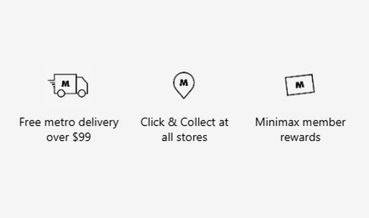

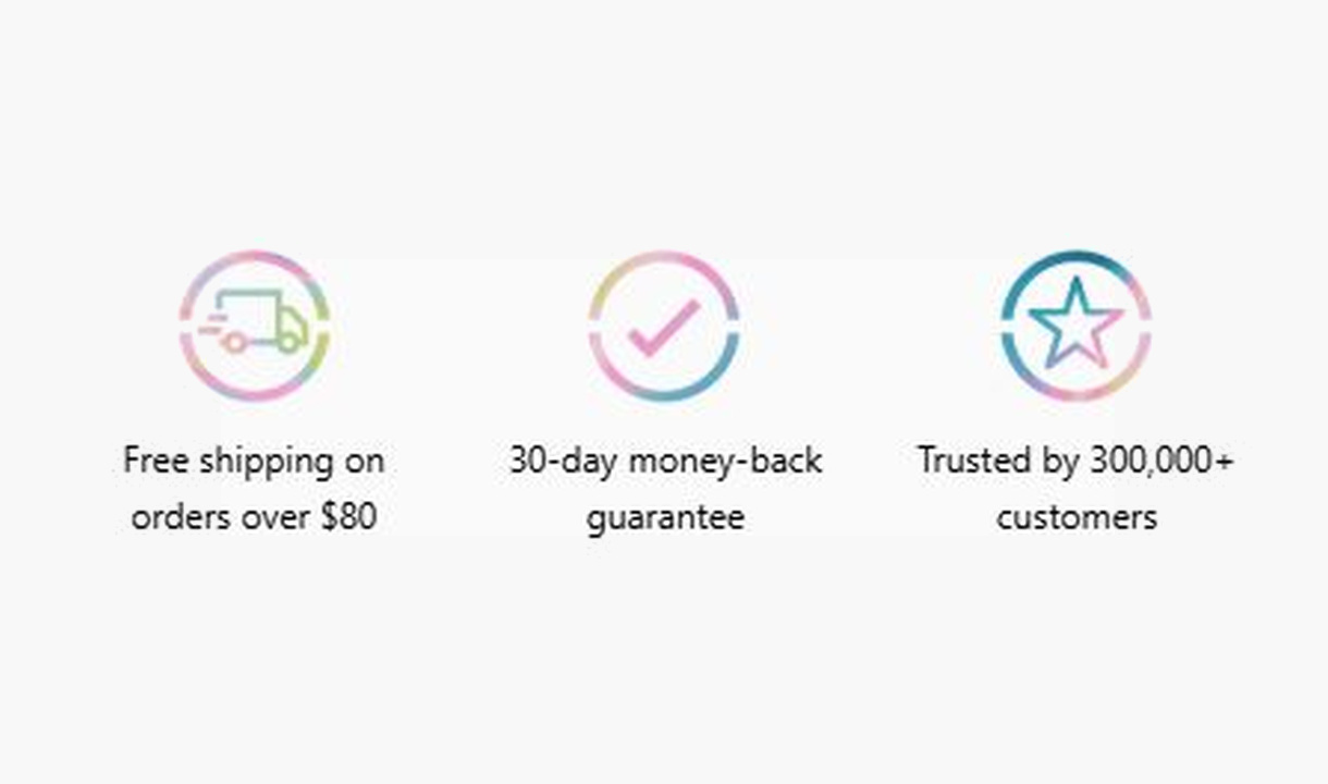

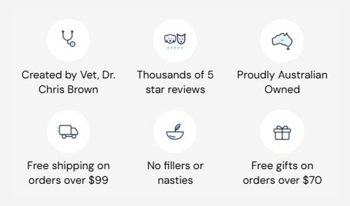

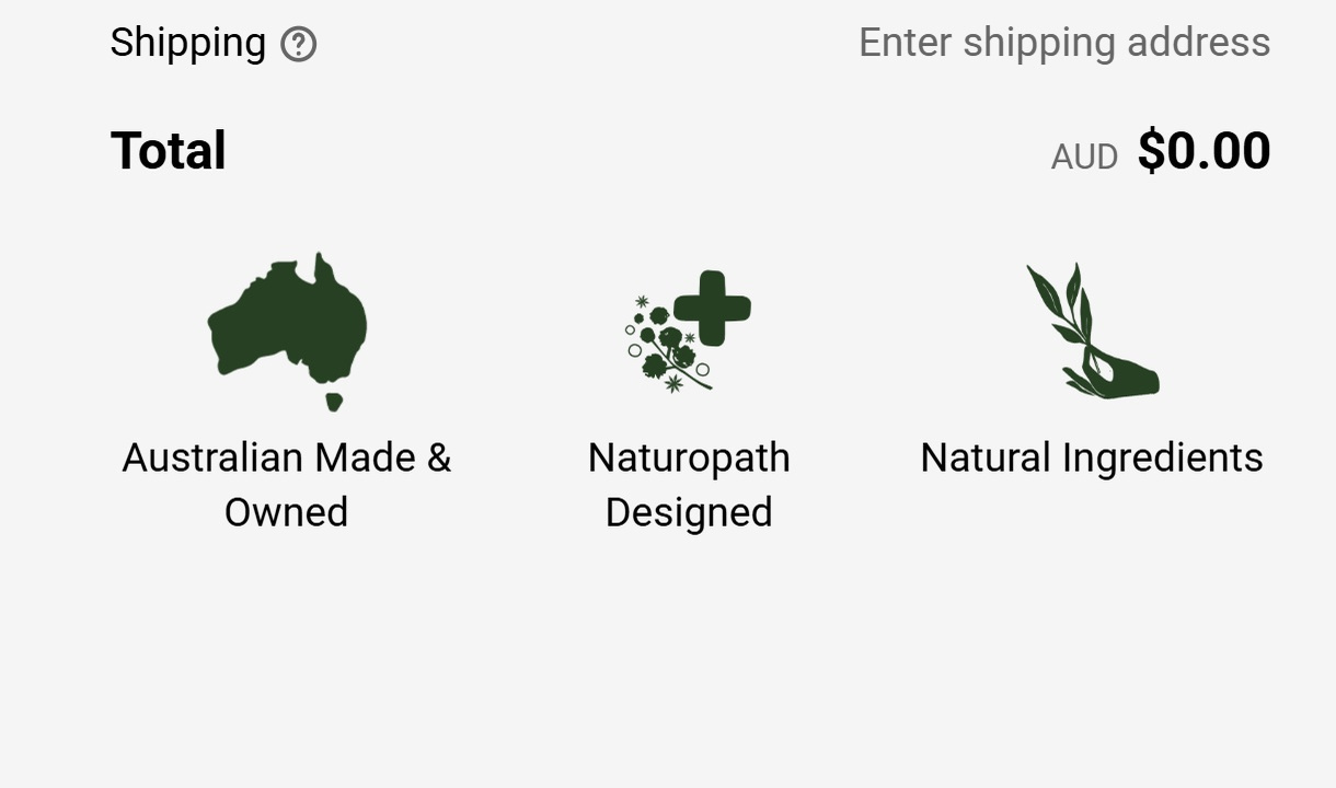



Show the reassurance that matters to each customer. Personalise trust badges around their cart, customer segment, or market.
For Shopify Plus Checkout
Configure your component.
Choose the reassurance
Use specific statements about the shipping, returns, or guarantees your store actually provides.
Pair text with an icon
Choose from the icon library or upload a custom image for each message.
Choose who sees each set
Set conditions based on cart contents, customer segments, or markets.
Pair icons or custom images with short messages about shipping, returns, or product benefits. Use cart contents, customer segments, and market conditions to show different badges to different customers, keeping each message relevant.
The tools behind your components.
Connect content, audience, and presentation controls. Available settings depend on the component and its version.
Good together.
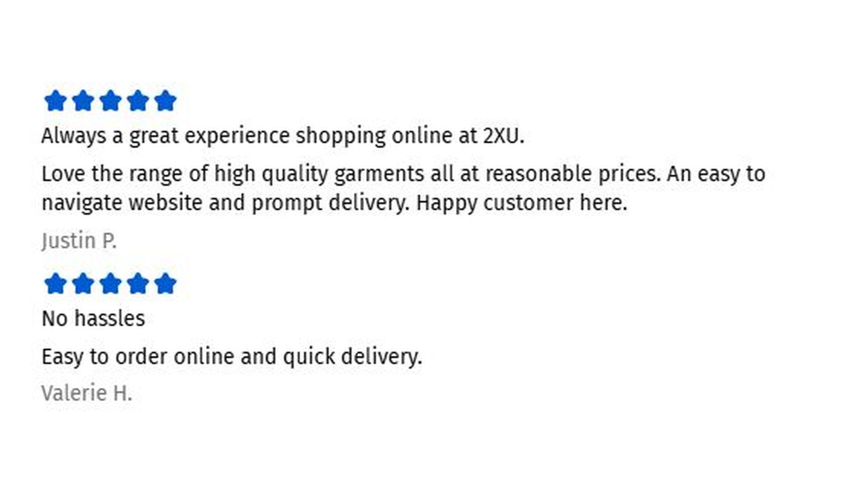
Testimonials
Show genuine customer feedback in Shopify checkout with manually entered star ratings, review text, and customer names.
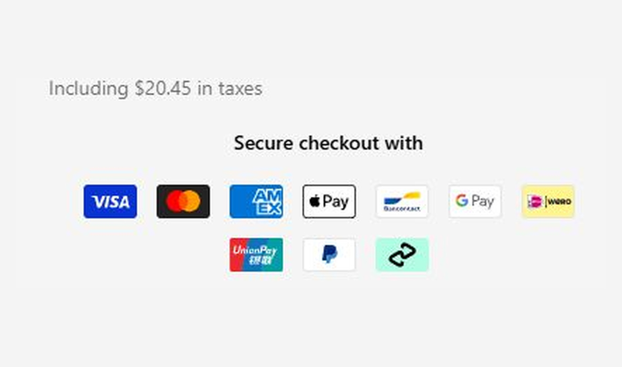
Payment icons
Show customers you accept their preferred way to pay. Choose payment icons to suit each market and customer group.
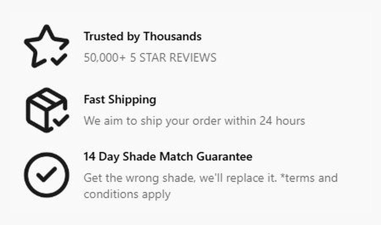
Callout
Give customers a reason to complete their order. Highlight brand benefits or explain a promotion, with more room than a trust badge.
Your questions, answered.
What can trust badges show in Shopify checkout?
Trust badges pair icons with short messages about benefits your store actually provides, such as returns, shipping, or product guarantees. They communicate reassurance rather than adding a certification or changing a policy.
Can I use my own trust-badge icons?
Yes. Choose from the searchable built-in icon library or upload custom artwork. You can configure the icon colour and background shape alongside the message.
Can I show different badges for different products or markets?
Yes. Use cart, customer, and market conditions to show the appropriate set. For example, show a product warranty only when an eligible product is in the cart.
Where can trust badges appear?
Add the component through the matching Dynamic Content block at a position supported by Shopify's checkout editor. Thank-you page content is available on Growth and above.
Will the component match my Shopify checkout branding?
Yes. Components use Shopify's checkout elements and inherit your checkout's fonts, colours, and styling. Use the component's appearance controls for the presentation options available to that component.
Can I translate the component into multiple languages?
Yes, on Growth and above. Add translations for the languages your store supports. Text without a translation uses your default wording; text embedded in uploaded images needs separate translated artwork.
Can I show it only on mobile or desktop?
Yes. In the matching Latest block in Shopify's checkout editor, set Show on devices to all, mobile, or desktop. Check the result in the editor's device previews before publishing.
Do I need Shopify Plus, and which app plan includes this component?
Yes. Checkout Components is built for Shopify Plus stores. Starter includes one content or input component; Growth and above include unlimited content and input components. Translations and thank-you page content are included on Growth and above.