Payment icons.
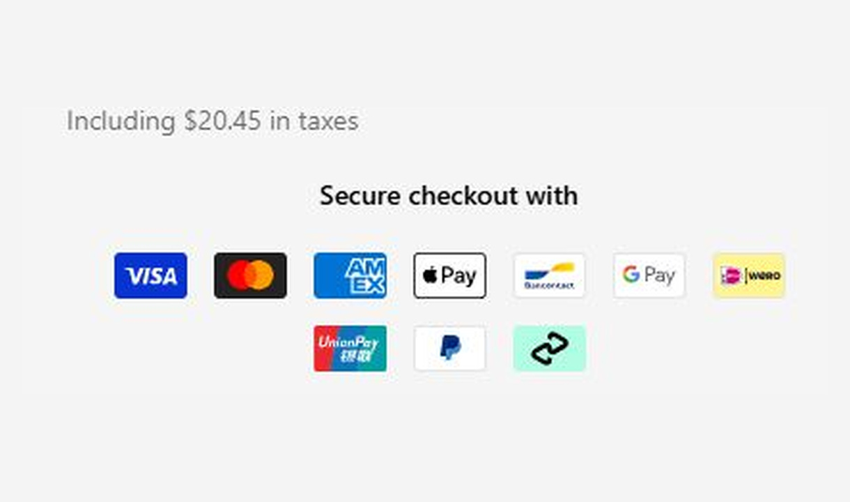

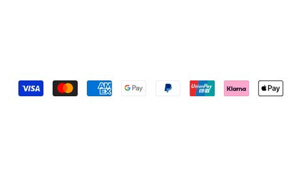

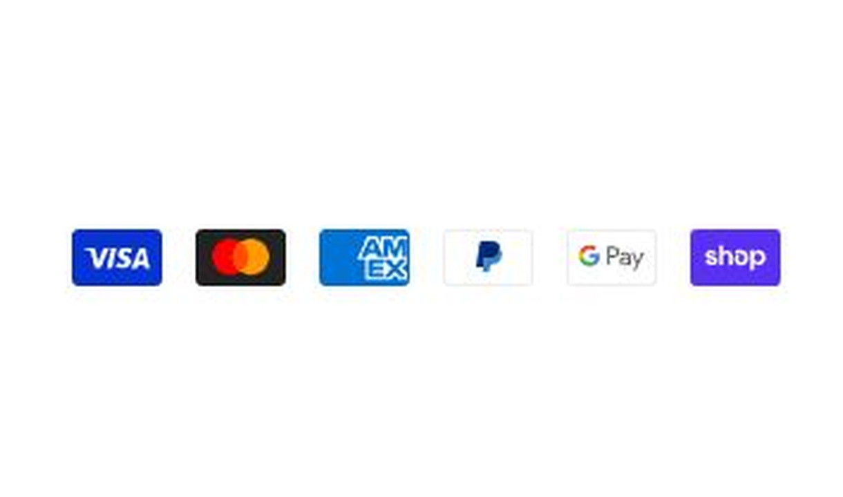

Show customers you accept their preferred way to pay. Choose payment icons to suit each market and customer group.
For Shopify Plus Checkout
Configure your component.
Choose your payment icons
Select the payment methods you want to display from those your store supports.
Match your market
Show familiar payment methods to customers in each market.
Pair with payment rules
Use payment-method Functions to customise available methods for specific customer groups.
Choose which payment methods to show, so shoppers can recognise a familiar way to pay. Pair the icons with payment-method Functions to customise the methods available to specific customer groups.
The tools behind your components.
Connect content, audience, and presentation controls. Available settings depend on the component and its version.
Good together.
Buy now pay later
Show your store's supported BNPL methods, the amount per instalment, and the payment schedule.
Trust badges
Show the reassurance that matters to each customer. Personalise trust badges around their cart, customer segment, or market.
Simple message
Give customers the information they need to keep going. Share short support, order, or brand messages without adding clutter to checkout.
Your questions, answered.
What does the Payment icons component do?
It displays recognisable logos for payment methods your store accepts. Showing familiar payment options can answer a customer's payment question before they reach the payment step.
Does displaying a payment icon activate that payment method?
No. Activate and configure the provider separately in Shopify. Display only the methods relevant to your store and customers; a logo does not guarantee eligibility for every order.
Can Payment icons hide, reorder, or rename payment methods?
No. The component controls the displayed logos. Payment Rules under Checkout Functions handle supported changes to actual payment methods, separately from the icons.
Can I show different payment icons in different markets?
Yes. Use market or customer conditions for different icon sets. Keep the displayed methods consistent with the payment options available to each audience.
How is Payment icons different from Buy now pay later?
Payment icons shows method logos. Buy now pay later explains supported instalment options, including the payment amount and schedule. Neither component activates a payment provider.
Will the component match my Shopify checkout branding?
Yes. Components use Shopify's checkout elements and inherit your checkout's fonts, colours, and styling. Use the component's appearance controls for the presentation options available to that component.
Can I show it only on mobile or desktop?
Yes. In the matching Latest block in Shopify's checkout editor, set Show on devices to all, mobile, or desktop. Check the result in the editor's device previews before publishing.
Do I need Shopify Plus, and which app plan includes this component?
Yes. Checkout Components is built for Shopify Plus stores. Starter includes one content or input component; Growth and above include unlimited content and input components. Translations and thank-you page content are included on Growth and above.